Build an Ivory and Taupe Scarf Palette
Ivory and taupe offer a small palette to compare using opaque scarves already in your cupboard. Start with the actual cloth rather than trying to match a screen color exactly.
Read the note ↓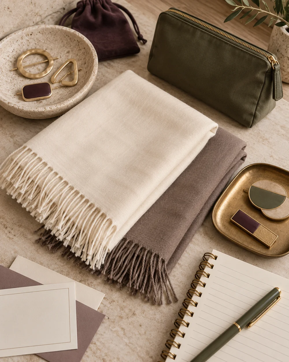
NOTE 01
Choose the actual pieces
Choose one clean ivory scarf and one taupe scarf. Check their care labels and lay them on a clean surface away from pins, liquids, and anything that could mark the fabric.
NOTE 02
Make the first arrangement
Fold the ivory cloth broadly and add a smaller taupe area beside it. Photograph the arrangement from above with soft daylight and enough background around both pieces.
NOTE 03
Compare one change
Reverse the proportions so taupe becomes the broad base. Keep the camera and light similar, then compare whether either version makes the fabric edges easier to distinguish.
NOTE 04
Keep a useful reference
Keep the reference you prefer and note which actual scarves were used. This is a color exercise, not proof of fiber content, opacity in every setting, or suitability for a particular fastening.
Before you go.
What is the most useful detail to remember?
Change the visible proportions before adding a third color.
What should I establish before starting?
Choose one clean ivory scarf and one taupe scarf. Check their care labels and lay them on a clean surface away from pins, liquids, and anything that could mark the fabric.
Original editorial guidance. Photographs are AI-generated concepts; they do not show verified products, material specifications, or tested results. Sources & approach.
Save to Pinterest ↗FOLLOW THE DETAIL
A note to read next.
Scarf palettes
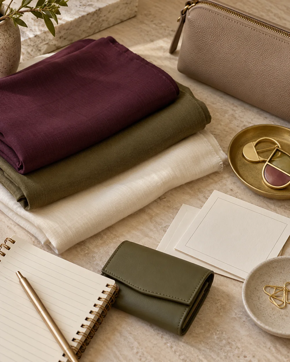
Compare Plum and Olive Scarf Accents
Read the note ↗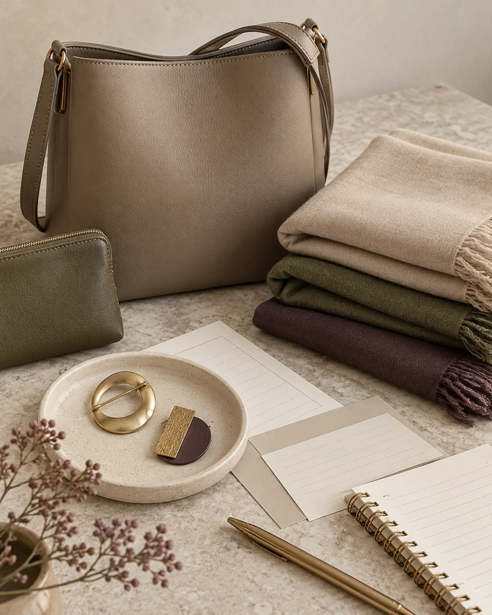
Scarf palettes
Choose a Scarf Palette From One Existing Bag
Read the note ↗
Scarf palettes