Compare a Brooch on Smooth and Textured Cloth
Smooth and textured cloth can change the way an accessory appears without changing its color. Compare both using the same closed brooch and a consistent tabletop setup.
Read the note ↓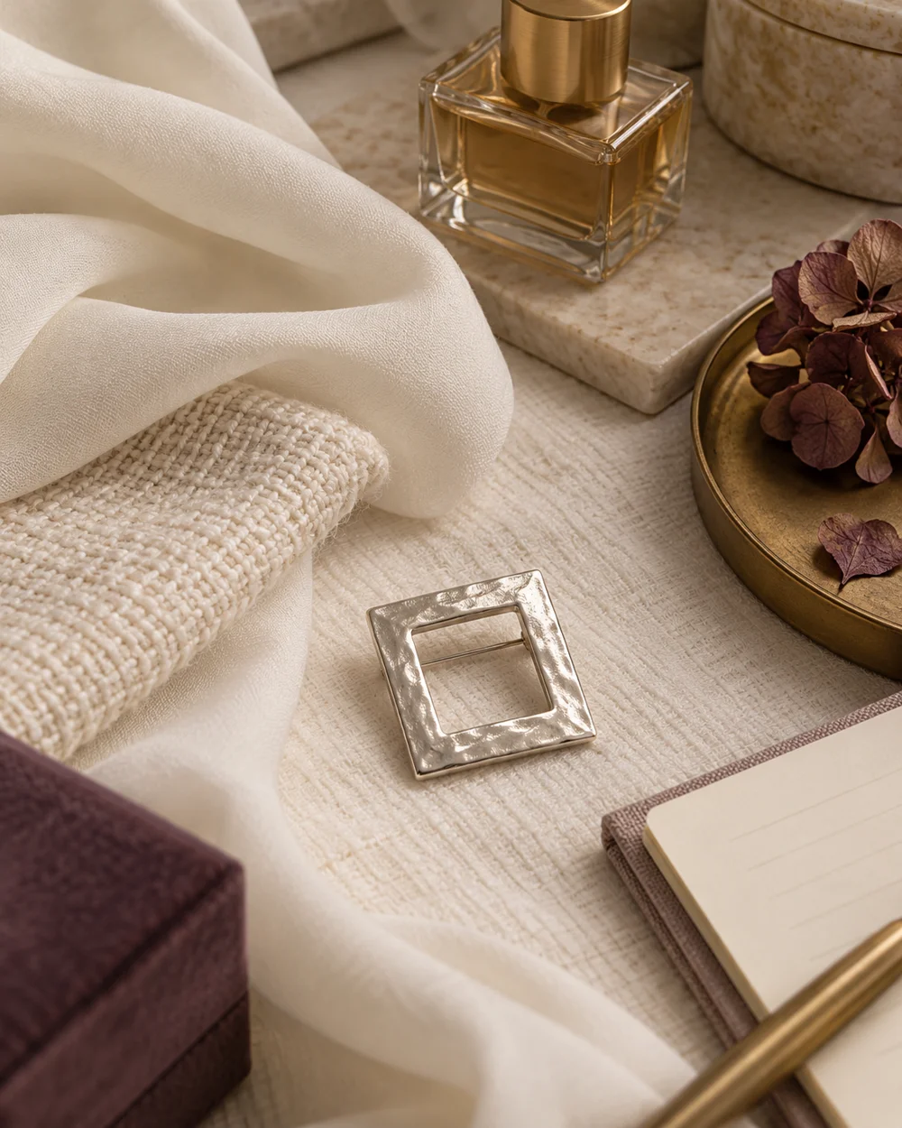
NOTE 01
Choose a starting point
Choose two opaque swatches in similar tones, one relatively smooth and one visibly textured. Place them side by side on a clean flat surface so differences in color do not dominate the exercise.
NOTE 02
Compare the arrangement
Set the brooch on the smooth cloth without fastening it. Photograph the outline and the nearby fold, leaving room around the piece. Note where reflections or shadows obscure its edge.
NOTE 03
Look at the difference
Move the brooch to the textured swatch and repeat from the same angle. Compare whether the weave adds useful depth or distracts from a small detail. Avoid dragging a pin or setting across either surface.
NOTE 04
Keep a useful reference
Keep both images and write one sentence about the difference you actually see. The visual comparison does not show whether the cloth can support the pin; assess that separately before use.
Before you go.
What is the most useful detail to remember?
Match the swatch tones as closely as practical to make texture the main comparison.
What should I establish before starting?
Choose two opaque swatches in similar tones, one relatively smooth and one visibly textured. Place them side by side on a clean flat surface so differences in color do not dominate the exercise.
Original editorial guidance. Photographs are AI-generated concepts; they do not show verified products, material specifications, or tested results. Sources & approach.
Save to Pinterest ↗FOLLOW THE DETAIL
A note to read next.
The brooch edit
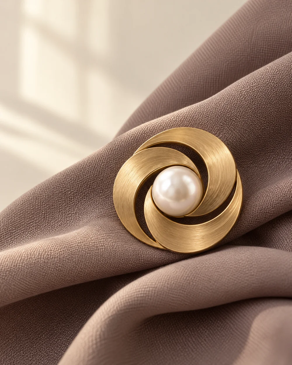
One brooch. A clear point of view.
Read the note ↗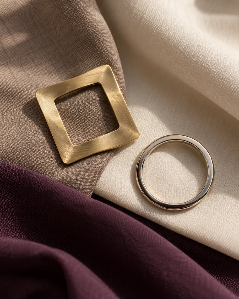
The brooch edit
Gold, silver, and a little space.
Read the note ↗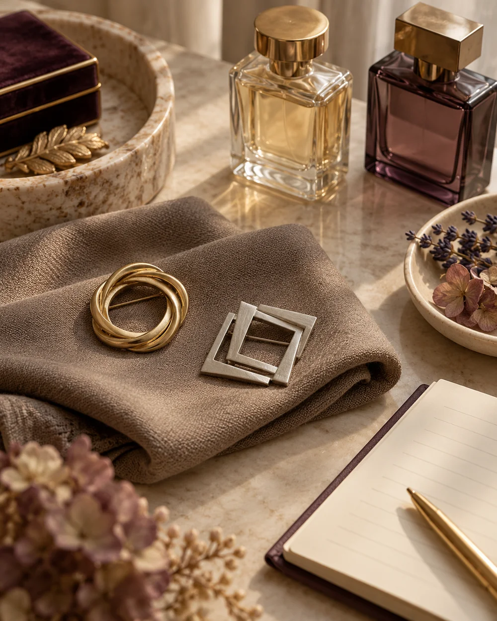
The brooch edit
Compare a Round Brooch With a Square Brooch
Read the note ↗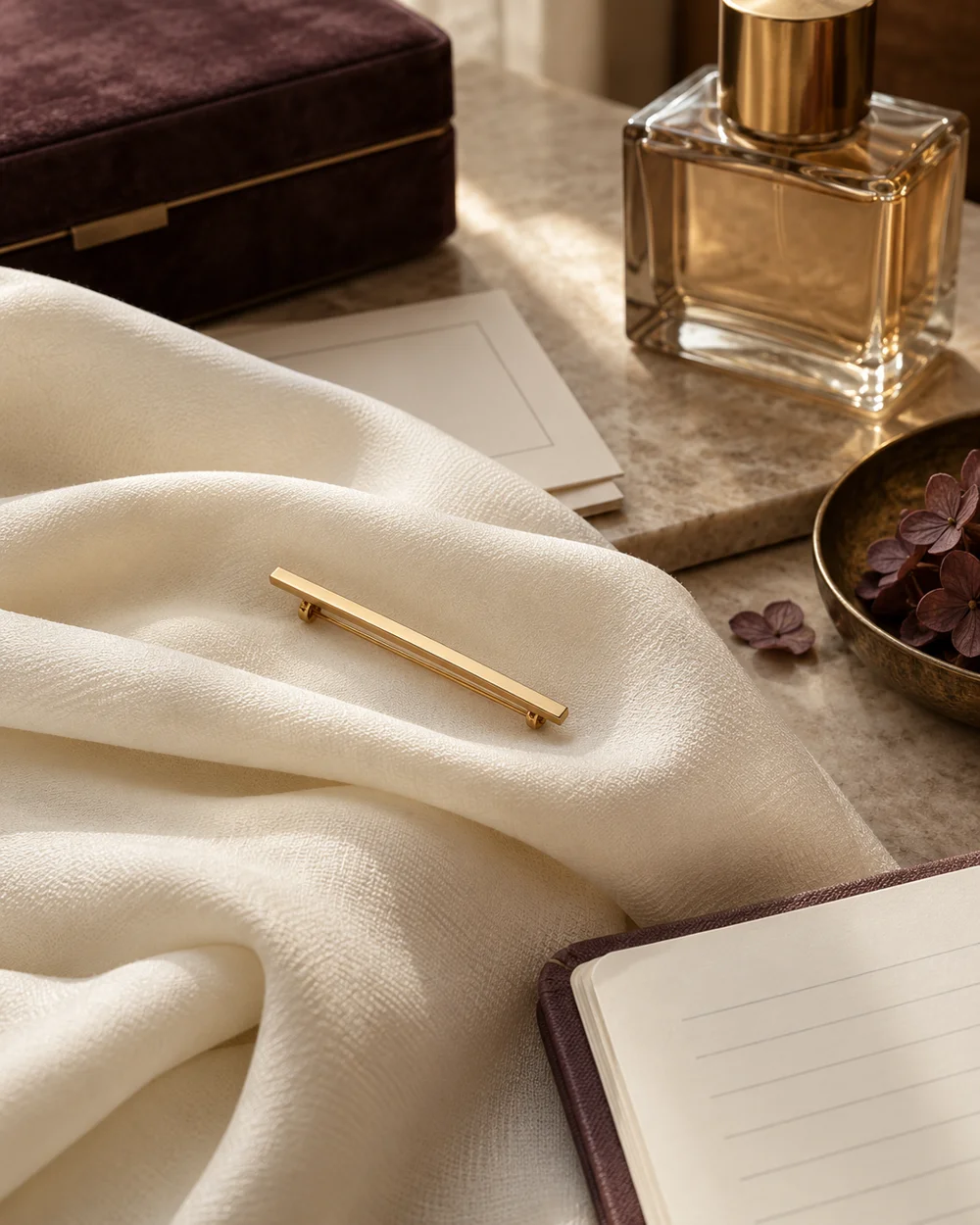
The brooch edit
Style a Bar Brooch on a Broad Fabric Fold
Read the note ↗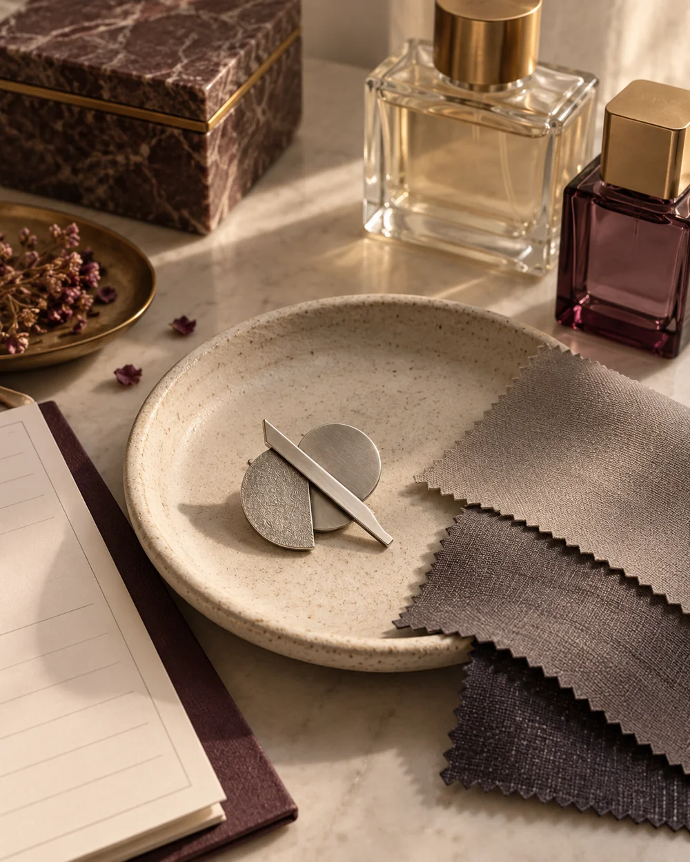
The brooch edit
Build a Monochrome Brooch Flat Lay
Read the note ↗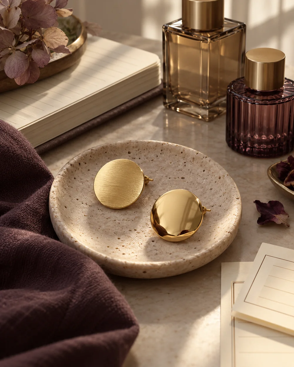
The brooch edit
Compare Matte and Polished Brooch Finishes
Read the note ↗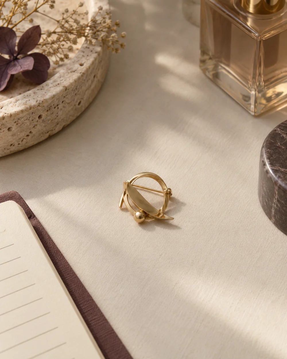
The brooch edit
Use Negative Space Around a Small Brooch
Read the note ↗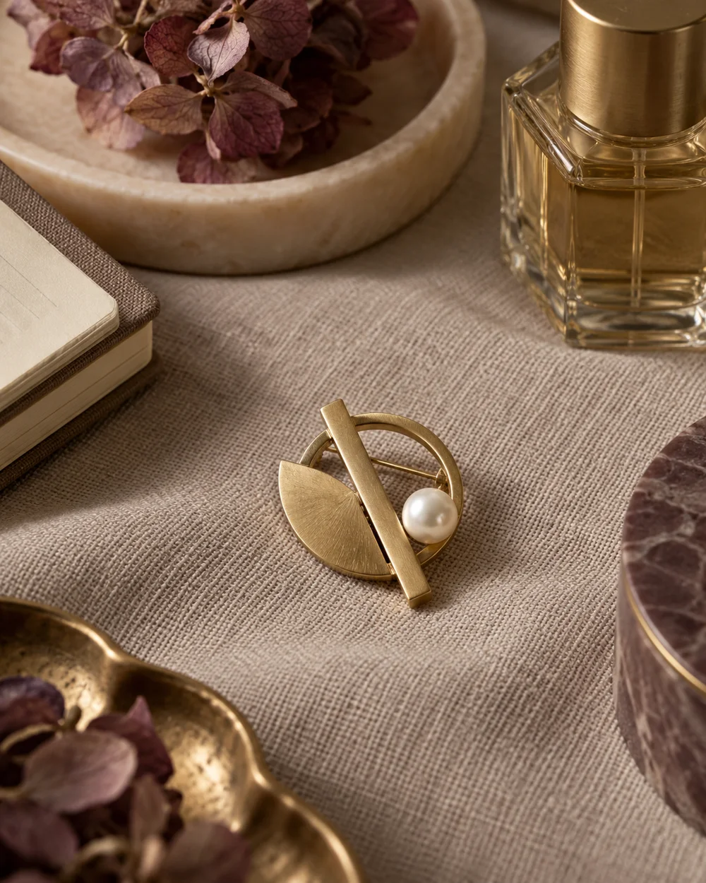
The brooch edit
Pair a Pearl Accent With Plain Woven Fabric
Read the note ↗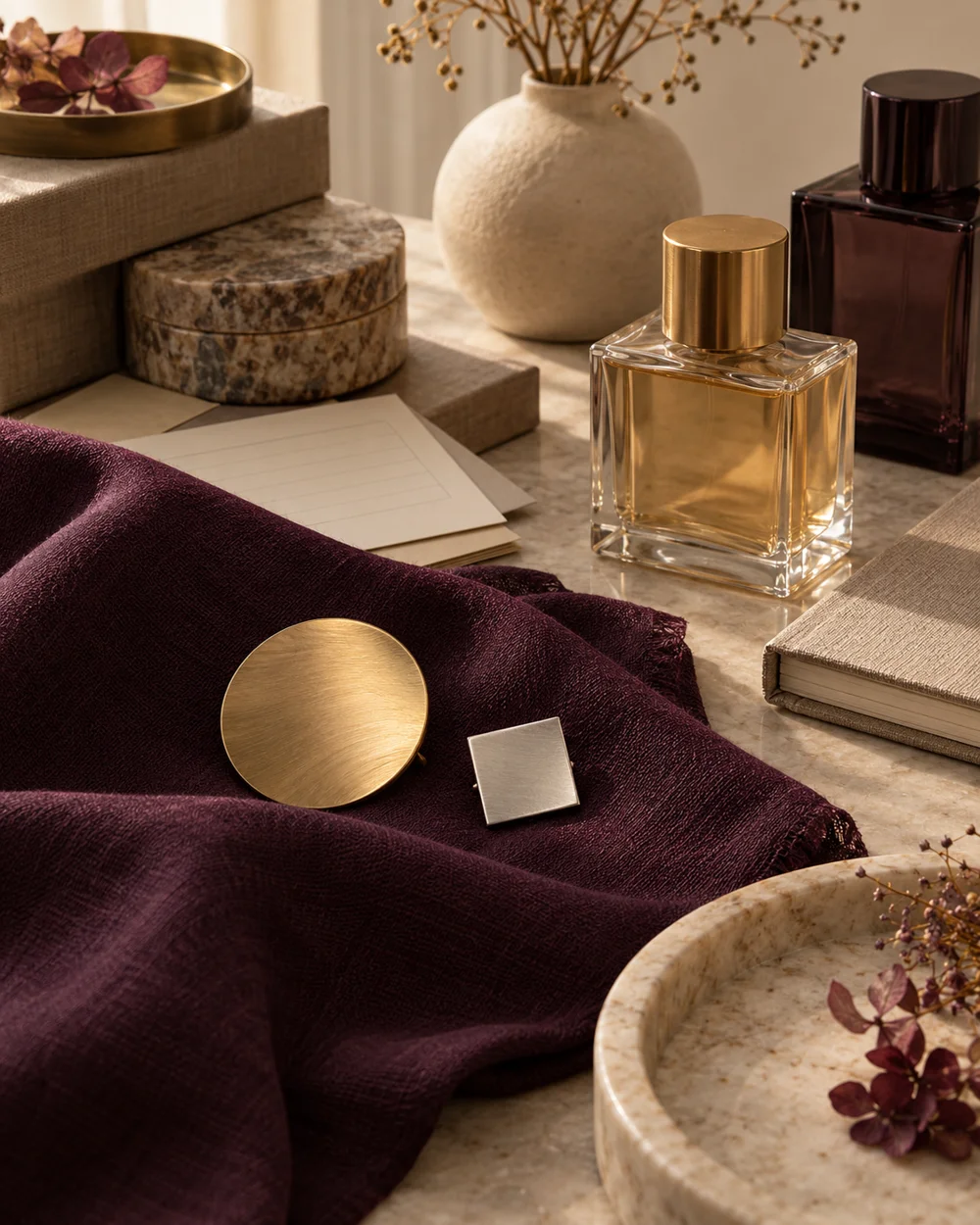
The brooch edit
Arrange Two Brooches With One Clear Focal Point
Read the note ↗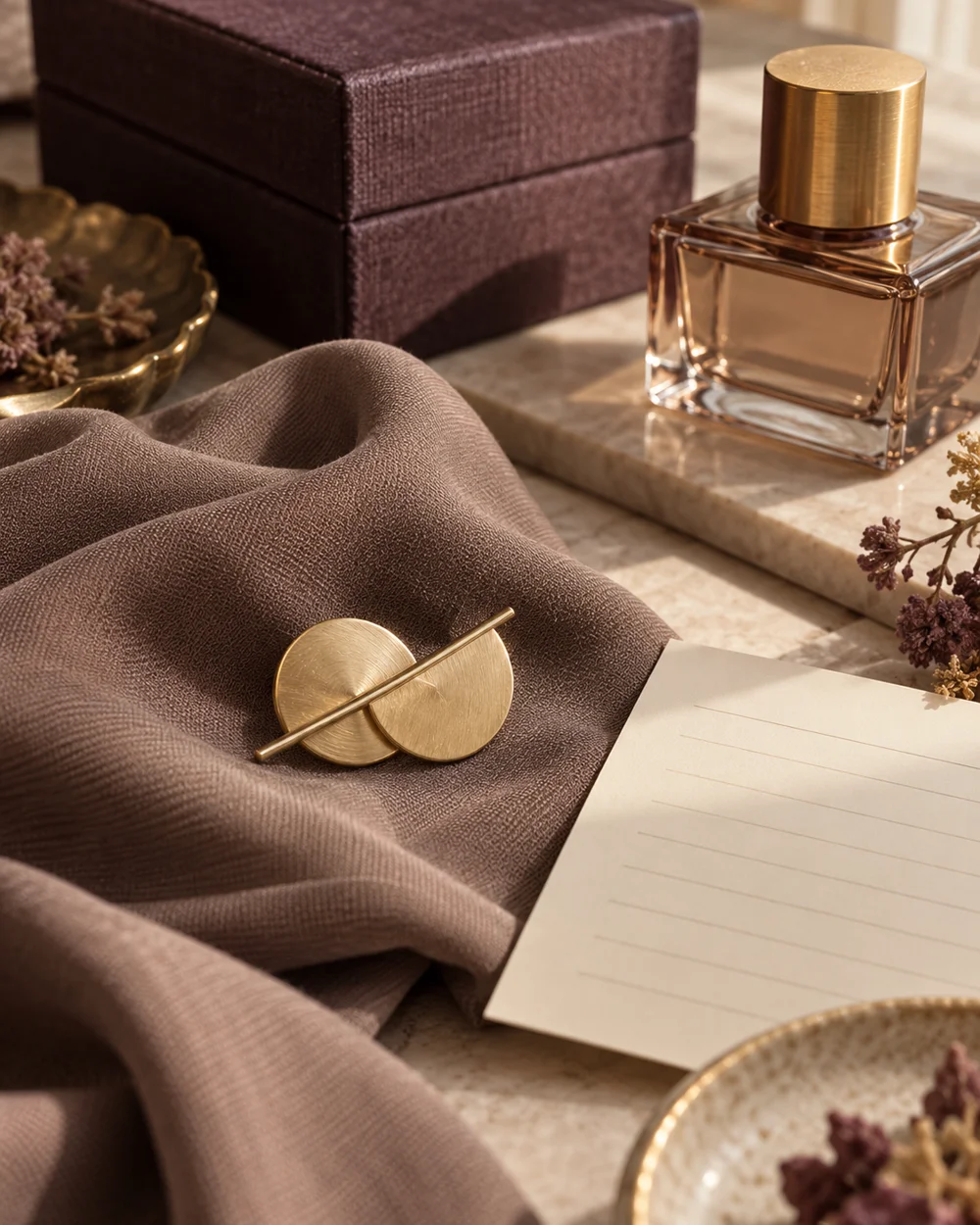
The brooch edit
Create a Taupe and Gold Accessory Palette
Read the note ↗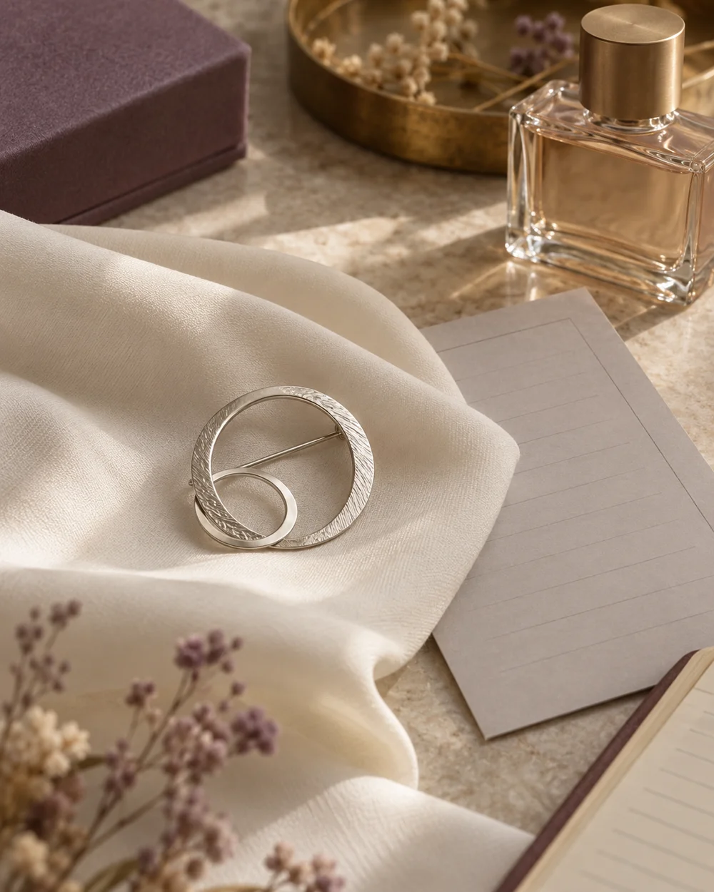
The brooch edit
Create an Ivory and Silver Accessory Palette
Read the note ↗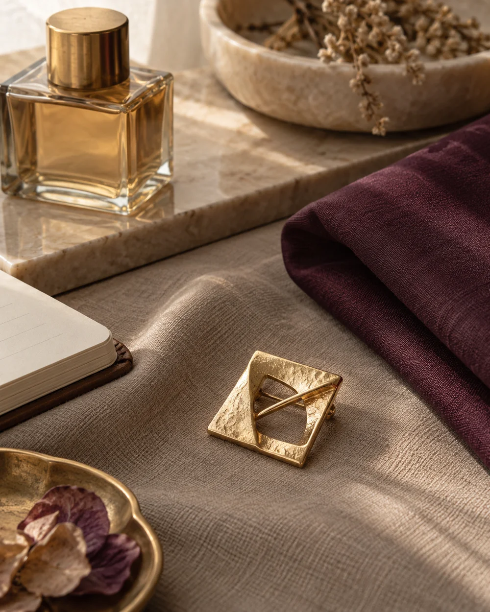
The brooch edit
Try a Plum Accent in a Neutral Brooch Arrangement
Read the note ↗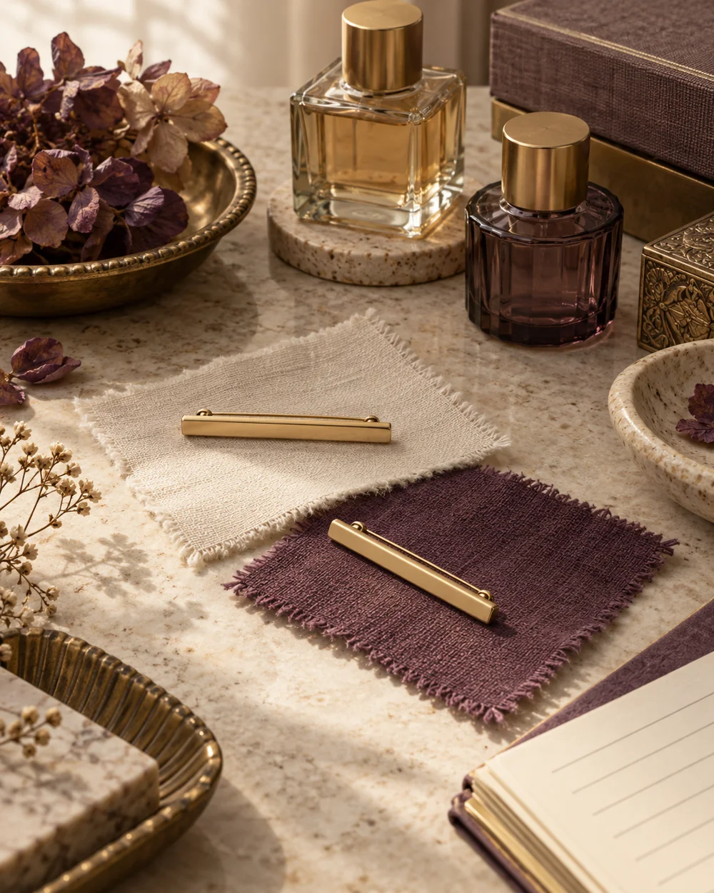
The brooch edit
Compare Horizontal and Diagonal Brooch Placement
Read the note ↗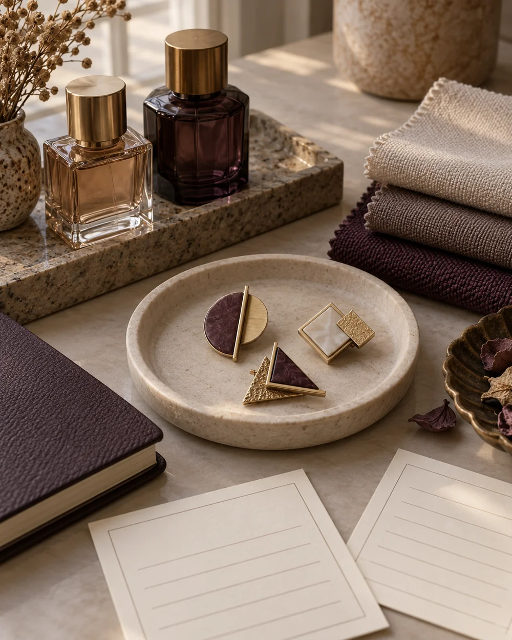
The brooch edit
Build a Small Brooch Reference Board
Read the note ↗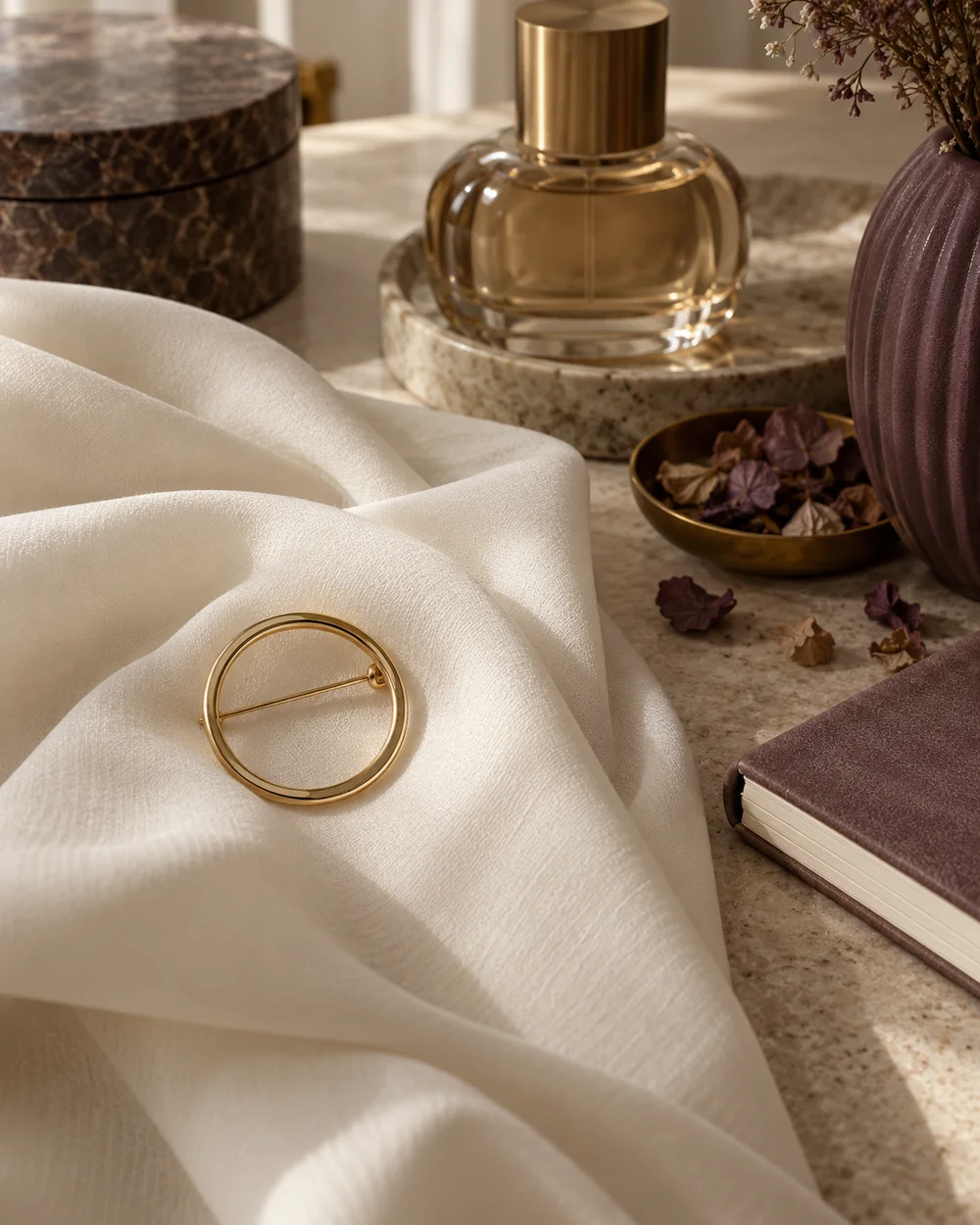
The brooch edit
Style an Open-Circle Brooch With Simple Folds
Read the note ↗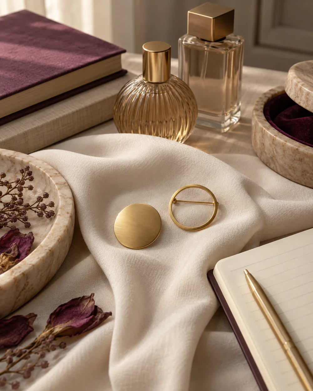
The brooch edit
Compare Solid and Open Geometric Brooch Shapes
Read the note ↗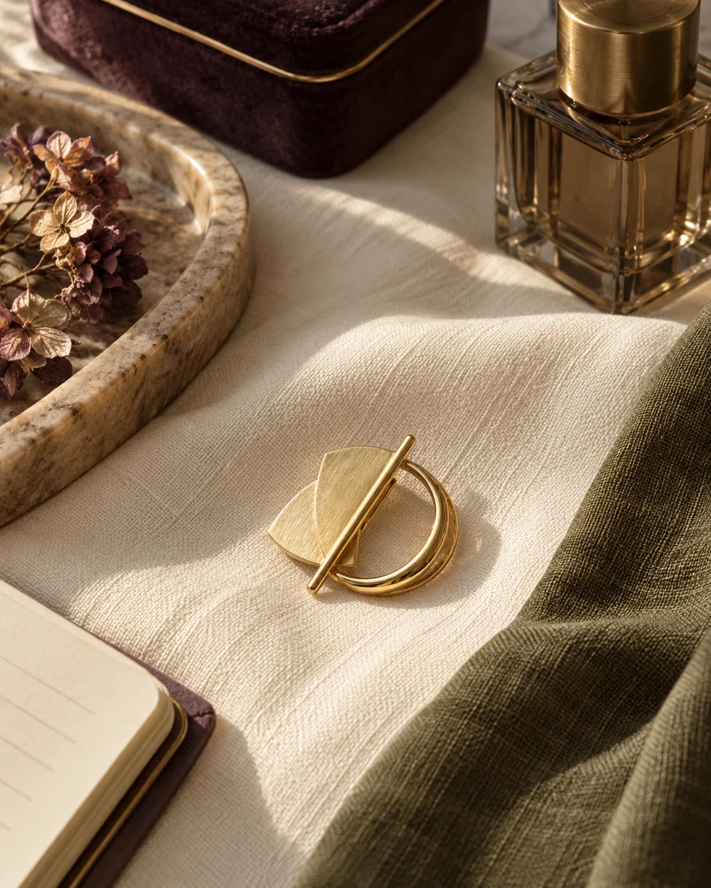
The brooch edit
Use a Narrow Accent Color Beside a Brooch
Read the note ↗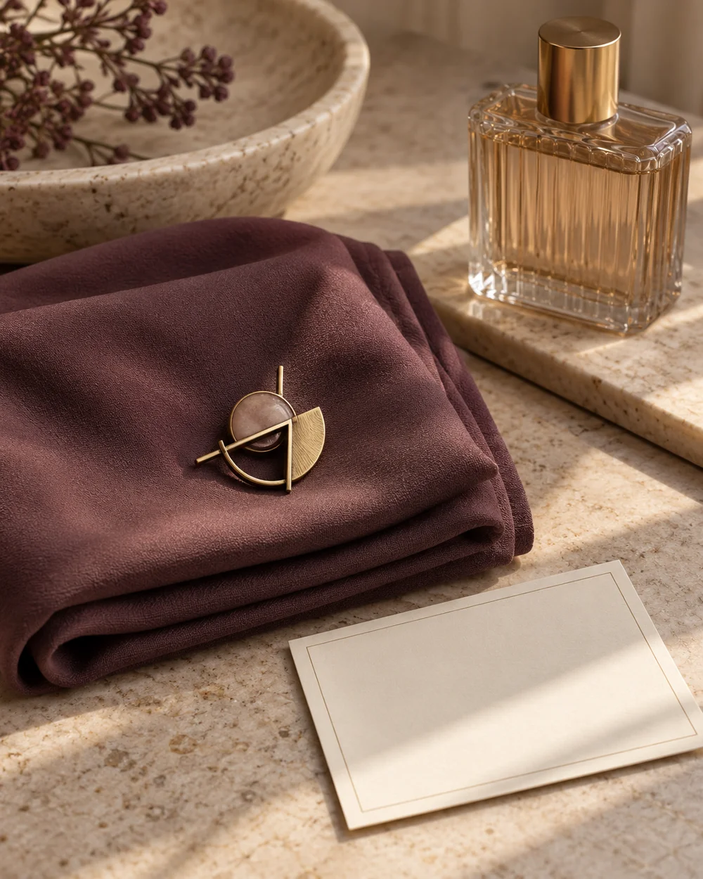
The brooch edit
Create a Balanced Three-Object Accessory Still Life
Read the note ↗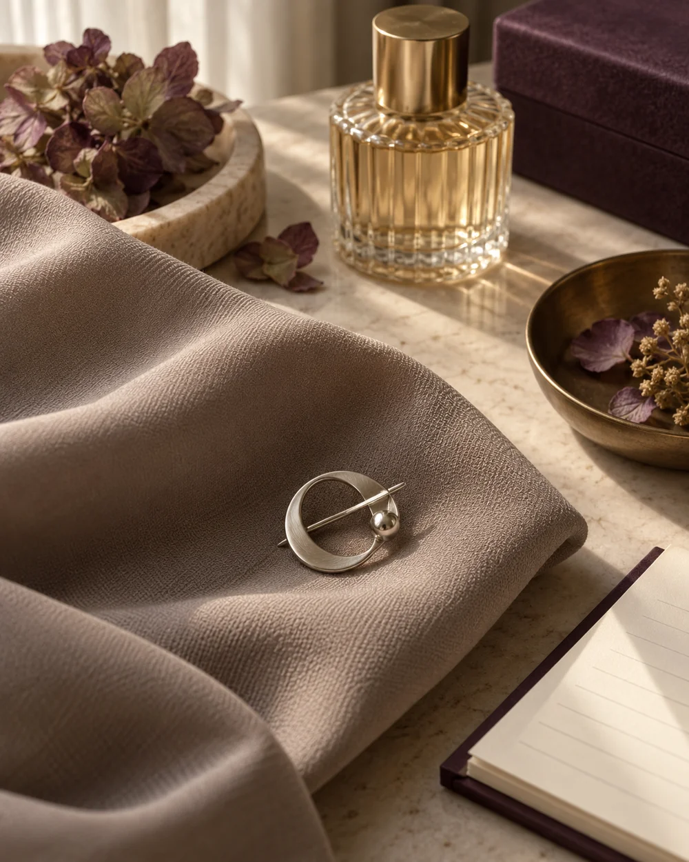
The brooch edit
Compare a Small Brooch Against a Large Fabric Fold
Read the note ↗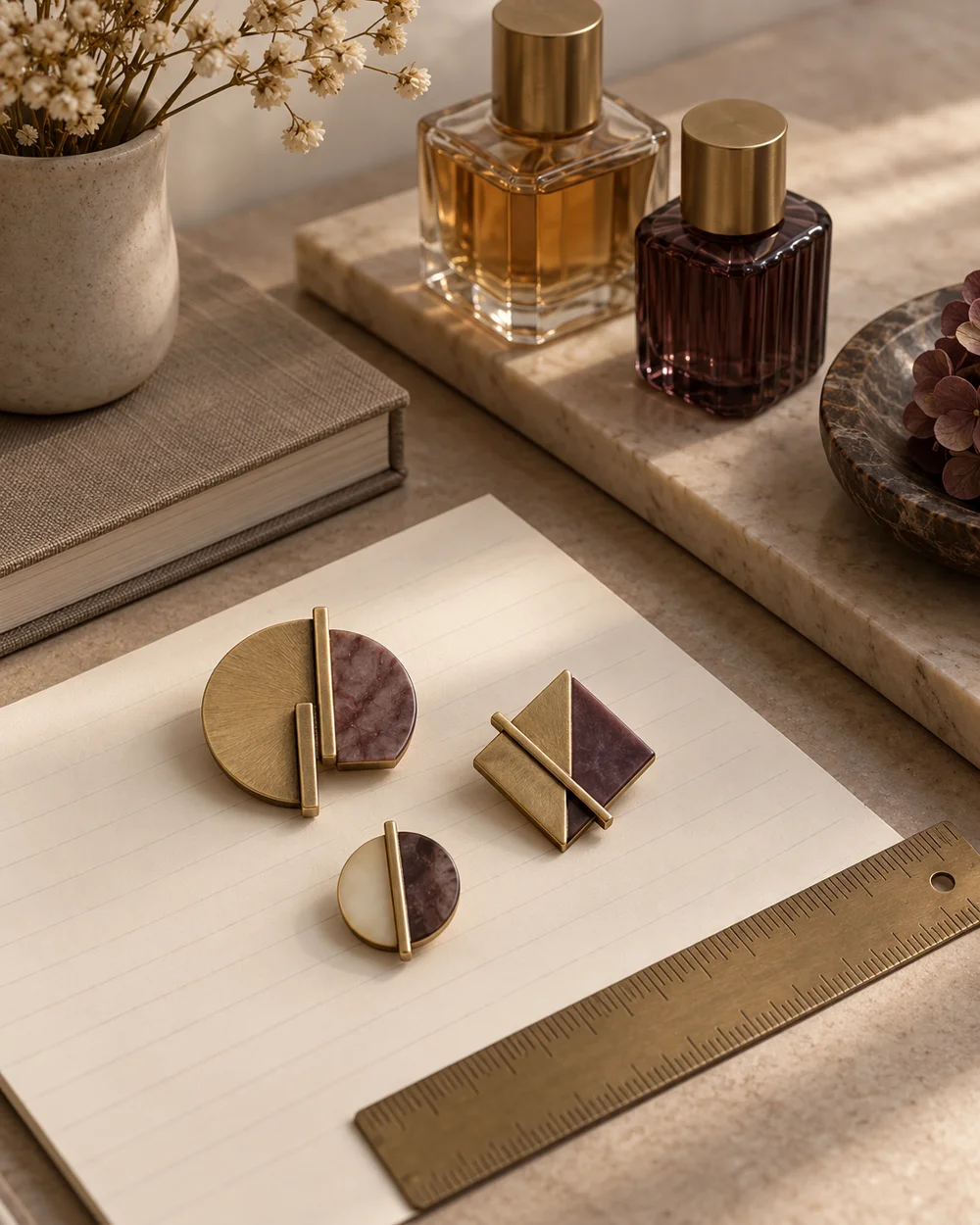
The brooch edit
Make a Simple Brooch Size Reference Sheet
Read the note ↗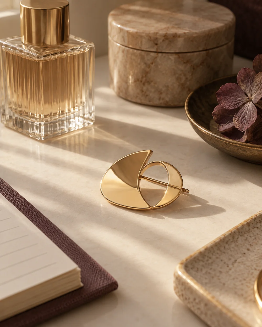
The brooch edit
Photograph a Reflective Brooch With Soft Side Light
Read the note ↗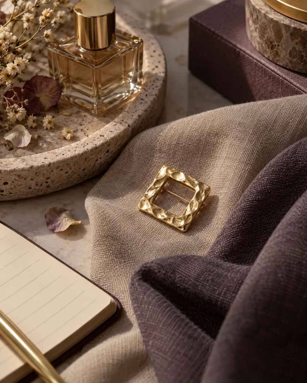
The brooch edit
Compare Warm and Cool Neutral Accessory Backgrounds
Read the note ↗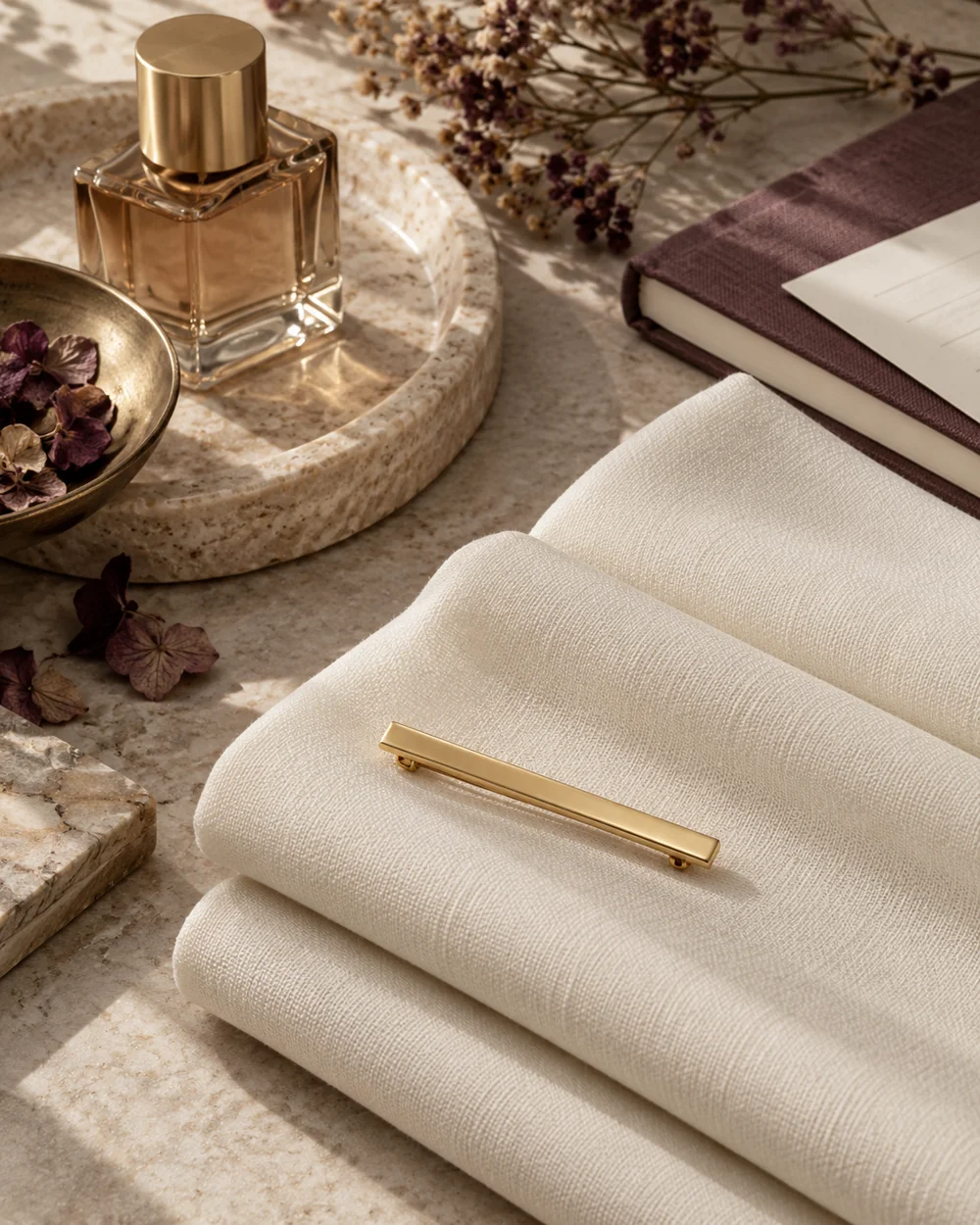
The brooch edit
Use Repeated Lines in a Brooch Arrangement
Read the note ↗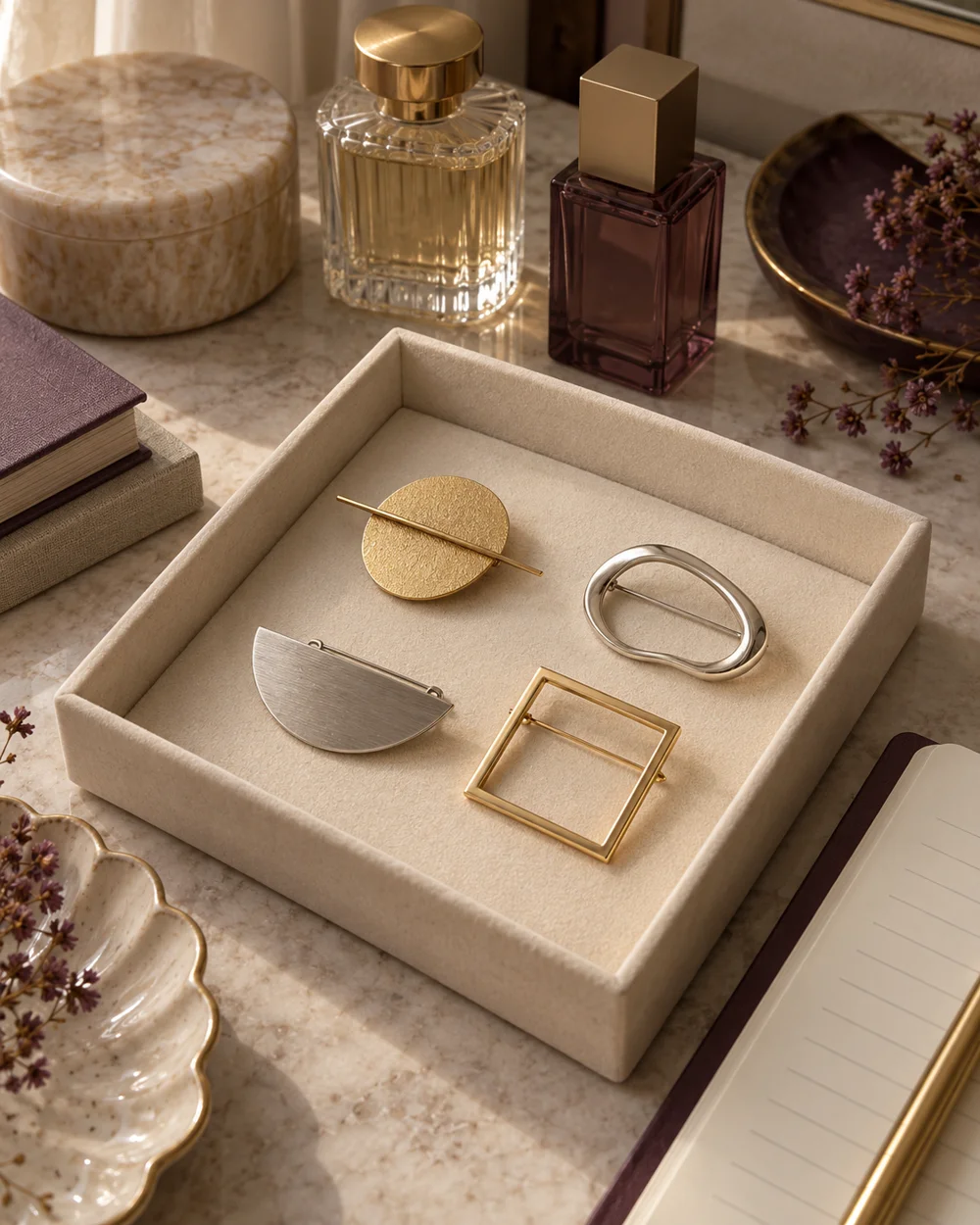
The brooch edit
Choose One Brooch From a Small Existing Collection
Read the note ↗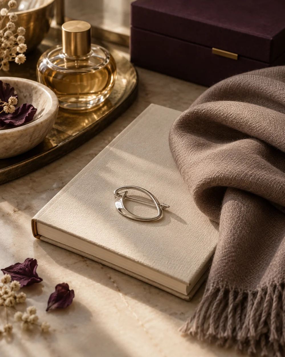
The brooch edit
Build a Quiet Accessory Arrangement for a Notebook Photo
Read the note ↗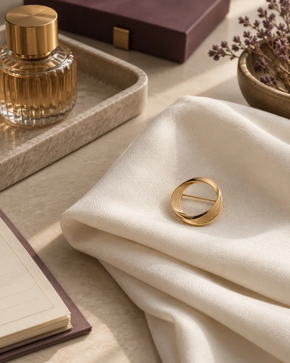
The brooch edit