Compare Warm and Cool Neutral Accessory Backgrounds
Warm beige and cooler gray backgrounds can give the same accessory different surroundings. Compare the actual swatches under one light source before choosing a reference palette.
Read the note ↓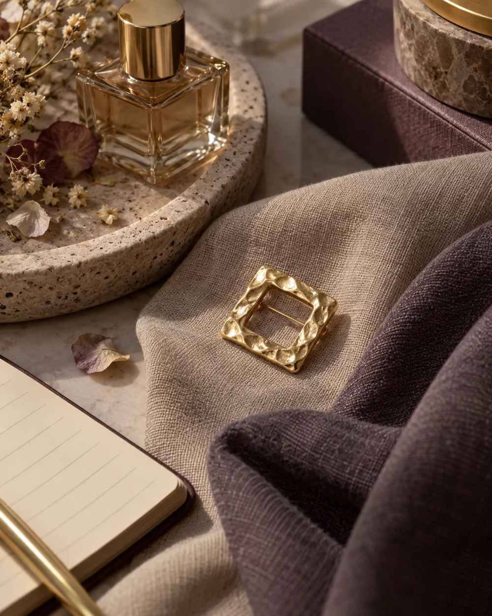
NOTE 01
Choose a starting point
Gather one warm neutral and one cool neutral opaque cloth along with a simple brooch. Choose similar lightness if possible so the first comparison focuses on the color relationship.
NOTE 02
Compare the arrangement
Place the closed accessory on the warm cloth and photograph it from a fixed angle. Leave enough background visible to judge the whole arrangement rather than only the metallic surface.
NOTE 03
Look at the difference
Repeat on the cool cloth without changing the lighting. Note whether either background makes the shape clearer or changes your impression of its color. These are subjective visual observations.
NOTE 04
Keep a useful reference
Save the comparison and identify the actual fabrics in your notes. Do not rely on a screen image to purchase an exact material match, because displays and lighting can change the appearance.
Before you go.
What is the most useful detail to remember?
Use real swatches beside the real accessory when an exact color relationship matters.
What should I establish before starting?
Gather one warm neutral and one cool neutral opaque cloth along with a simple brooch. Choose similar lightness if possible so the first comparison focuses on the color relationship.
Original editorial guidance. Photographs are AI-generated concepts; they do not show verified products, material specifications, or tested results. Sources & approach.
Save to Pinterest ↗FOLLOW THE DETAIL
A note to read next.
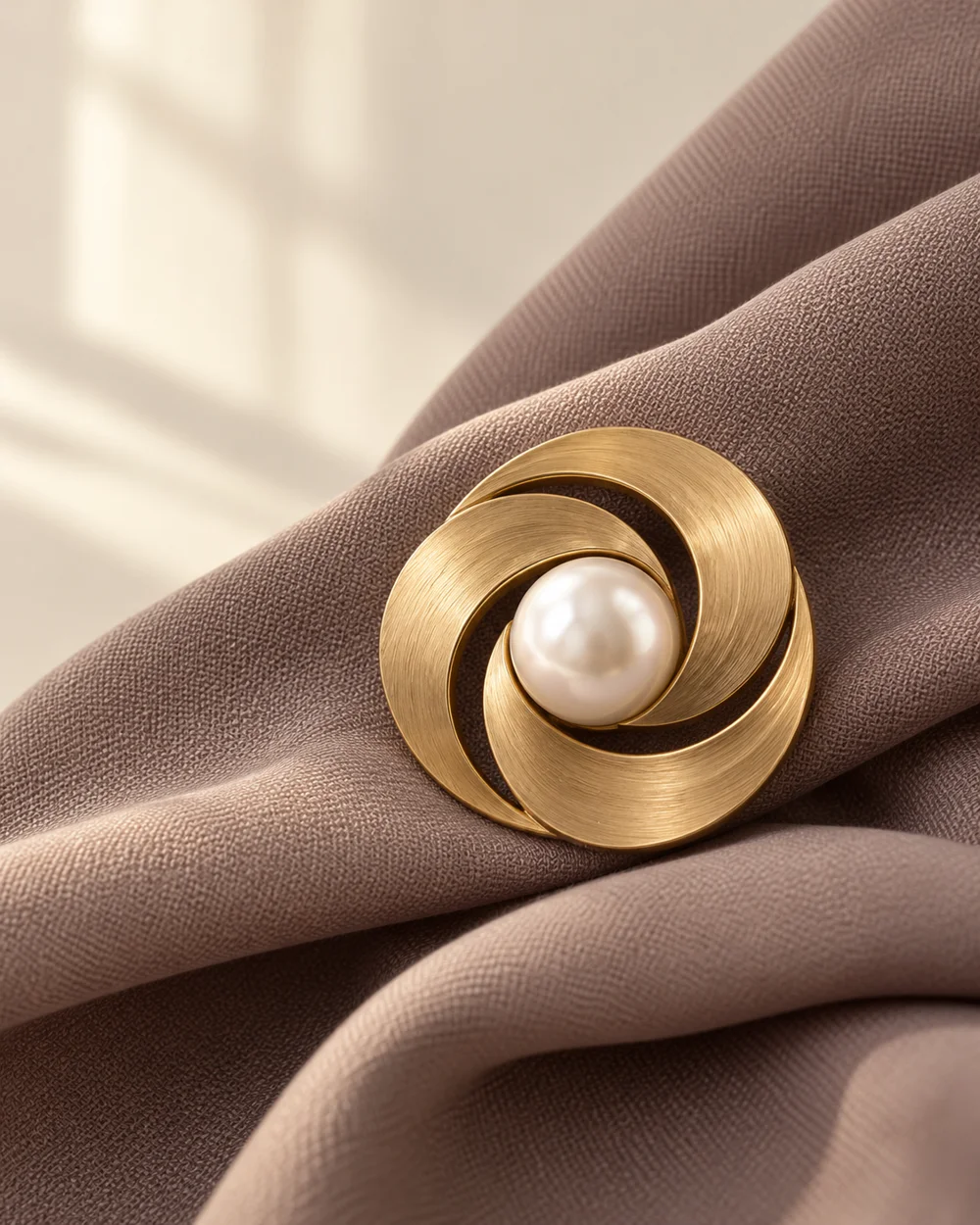
The brooch edit
One brooch. A clear point of view.
Read the note ↗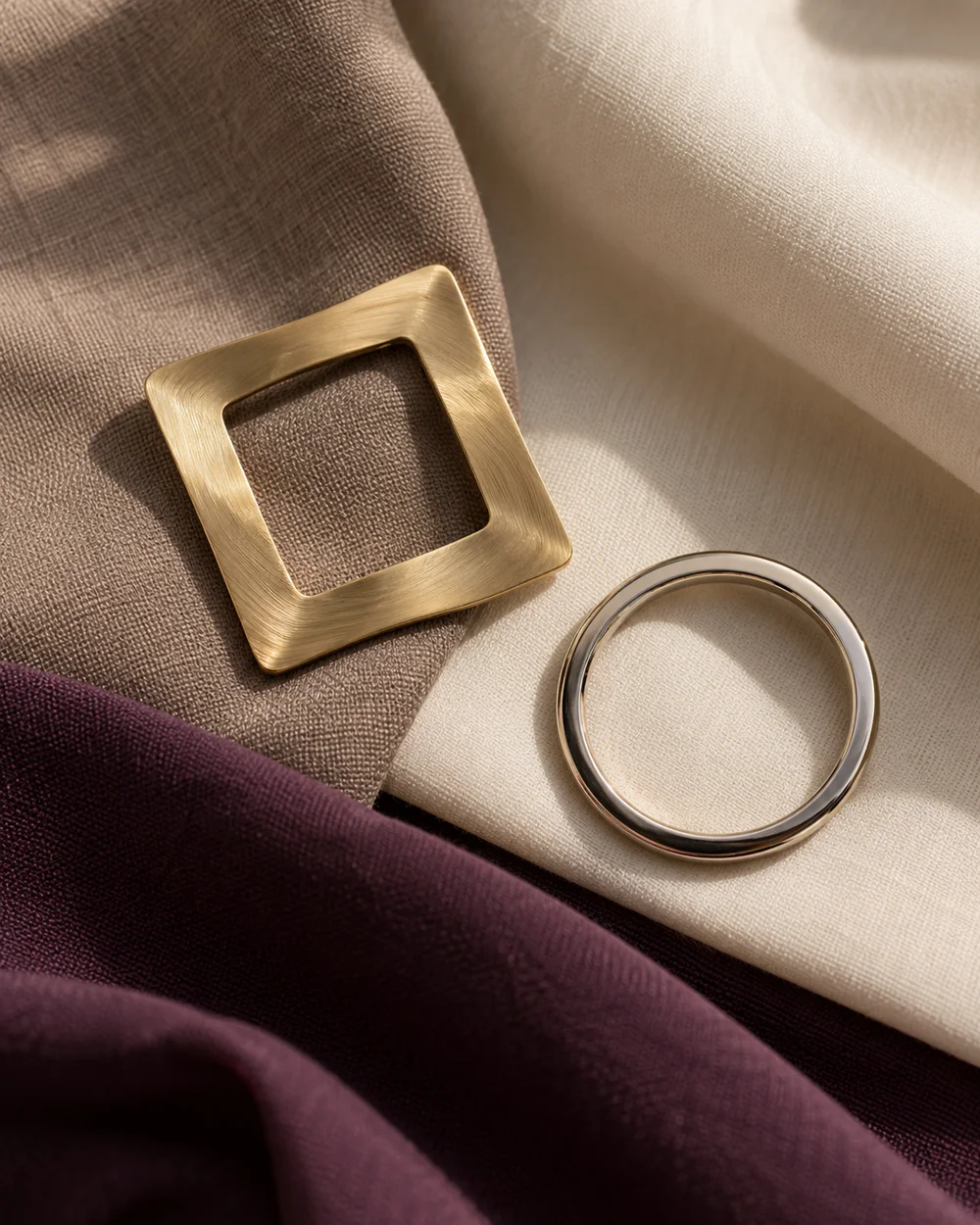
The brooch edit
Gold, silver, and a little space.
Read the note ↗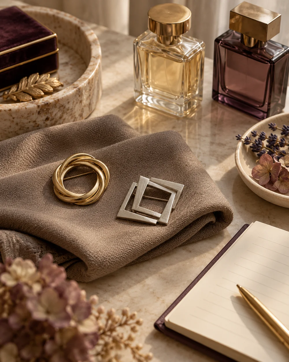
The brooch edit
Compare a Round Brooch With a Square Brooch
Read the note ↗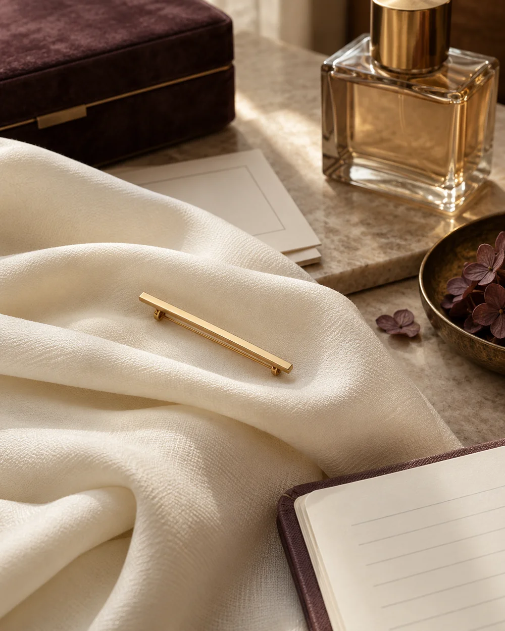
The brooch edit
Style a Bar Brooch on a Broad Fabric Fold
Read the note ↗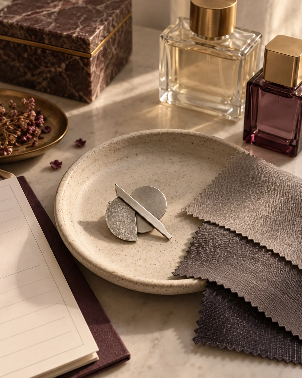
The brooch edit
Build a Monochrome Brooch Flat Lay
Read the note ↗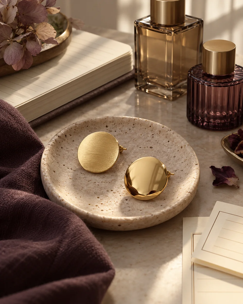
The brooch edit
Compare Matte and Polished Brooch Finishes
Read the note ↗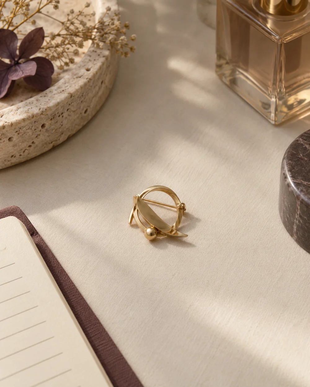
The brooch edit
Use Negative Space Around a Small Brooch
Read the note ↗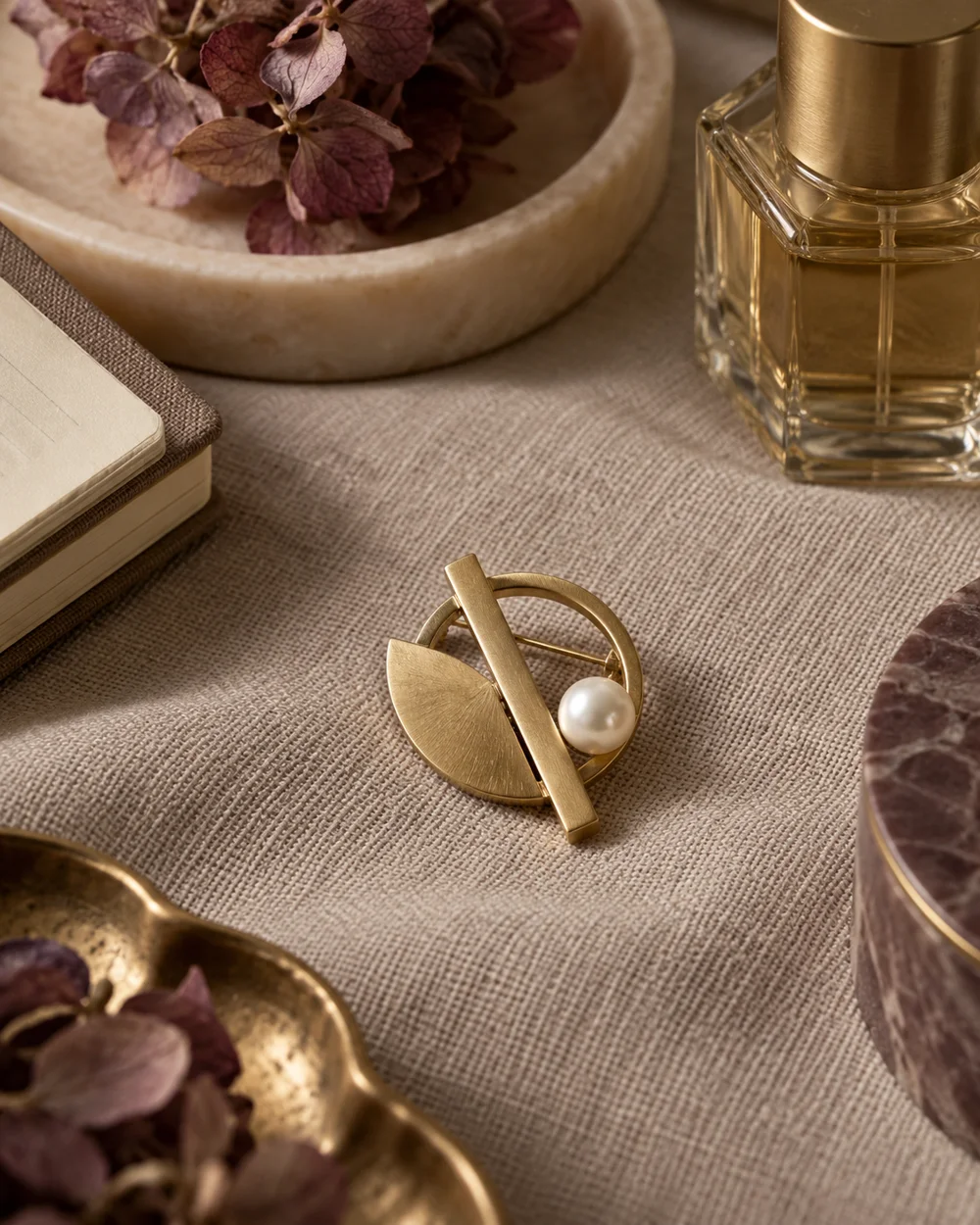
The brooch edit
Pair a Pearl Accent With Plain Woven Fabric
Read the note ↗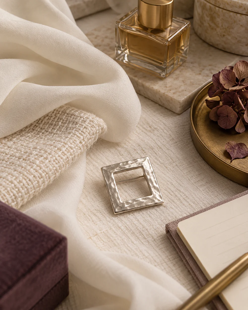
The brooch edit
Compare a Brooch on Smooth and Textured Cloth
Read the note ↗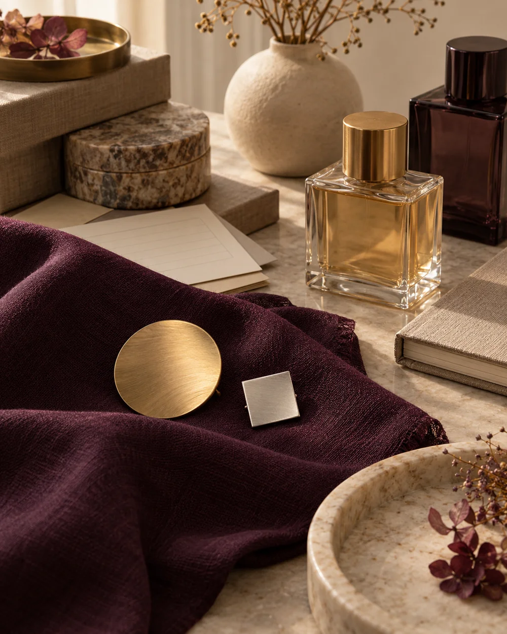
The brooch edit
Arrange Two Brooches With One Clear Focal Point
Read the note ↗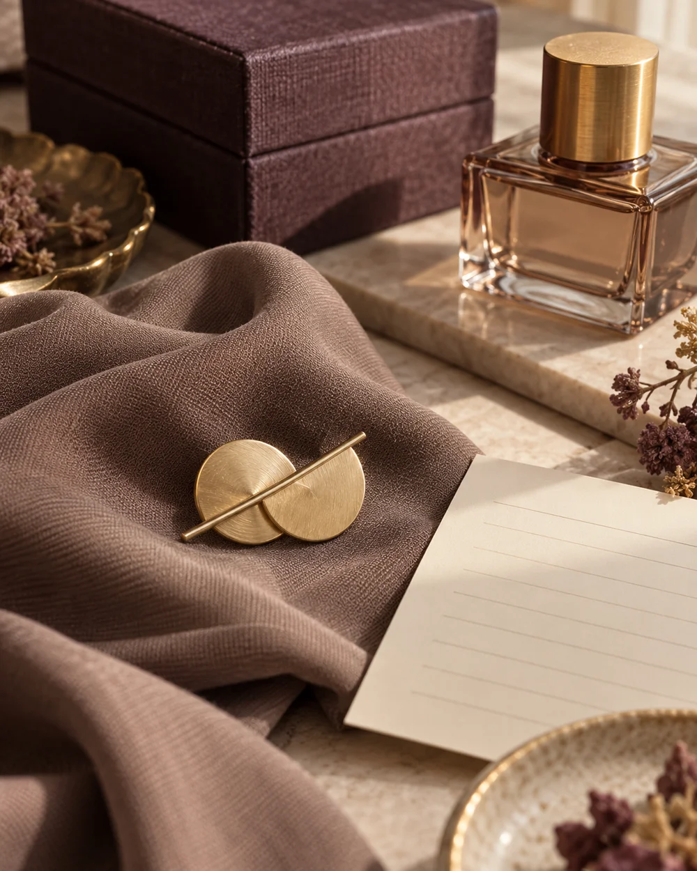
The brooch edit
Create a Taupe and Gold Accessory Palette
Read the note ↗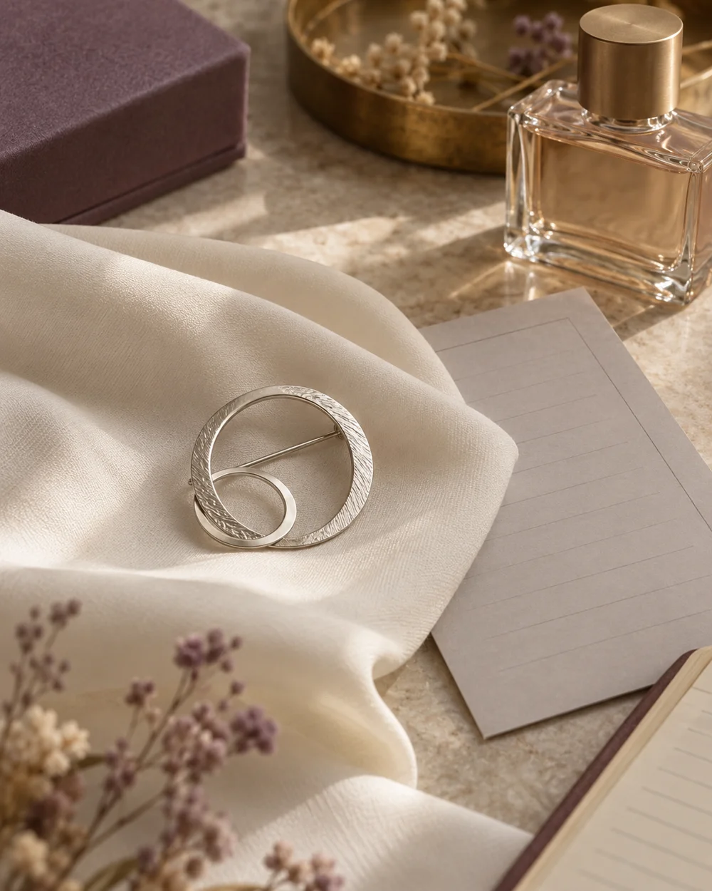
The brooch edit
Create an Ivory and Silver Accessory Palette
Read the note ↗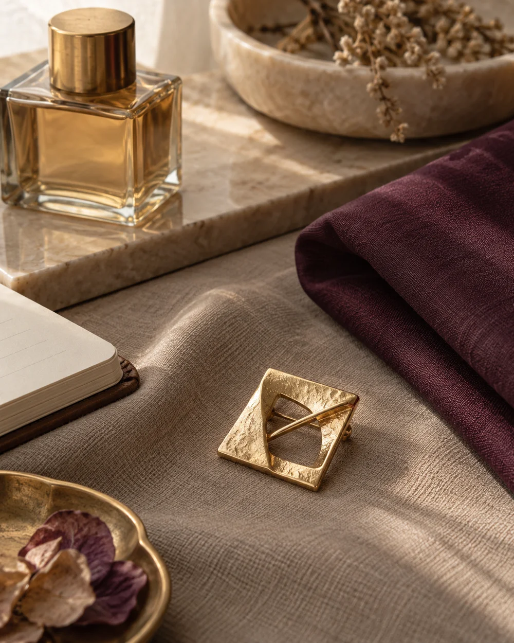
The brooch edit
Try a Plum Accent in a Neutral Brooch Arrangement
Read the note ↗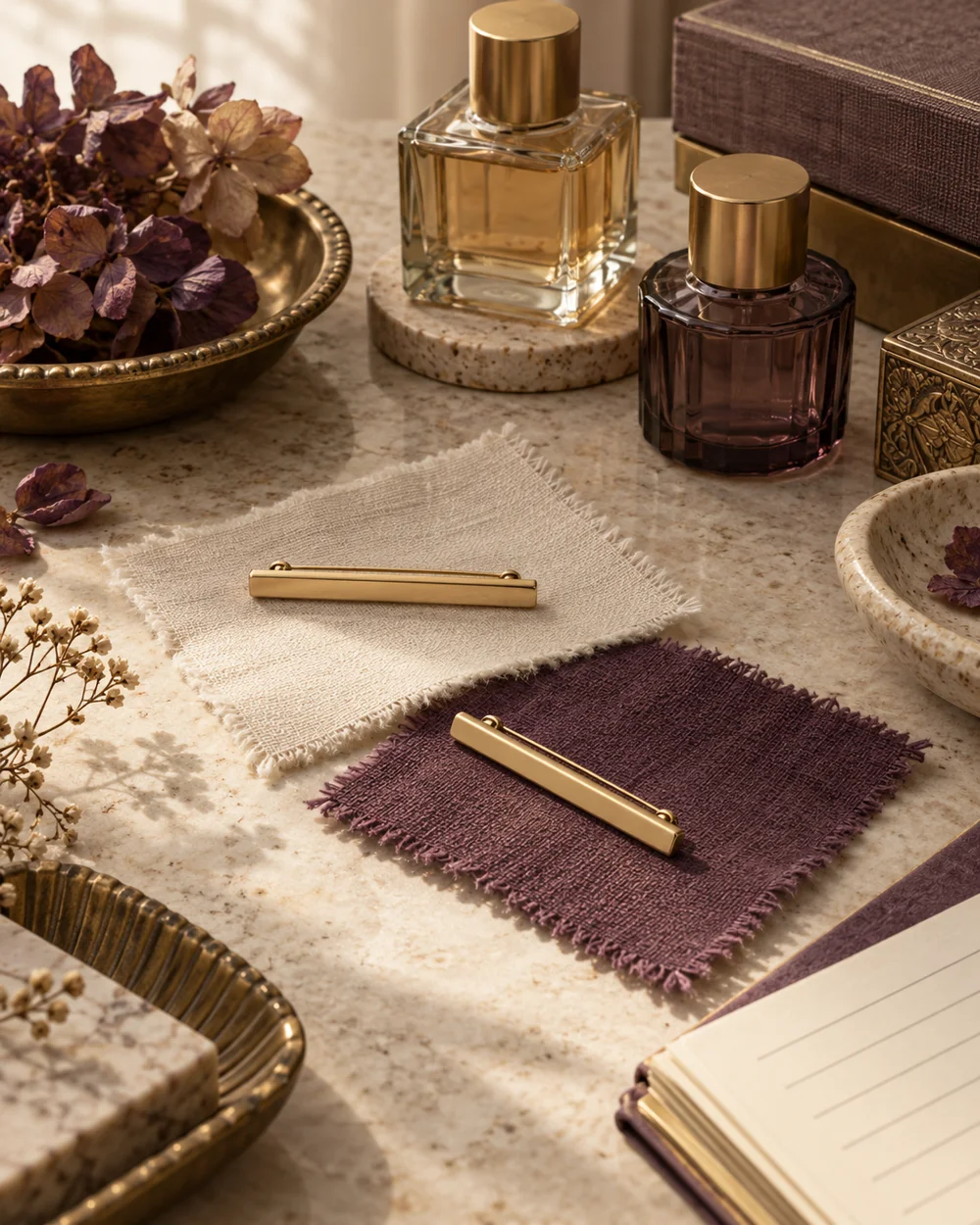
The brooch edit
Compare Horizontal and Diagonal Brooch Placement
Read the note ↗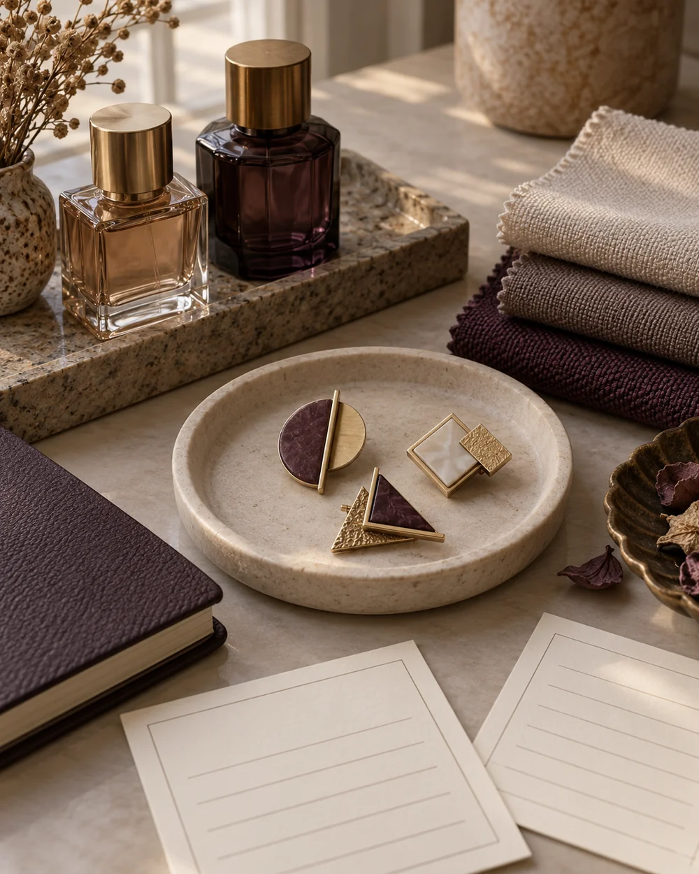
The brooch edit
Build a Small Brooch Reference Board
Read the note ↗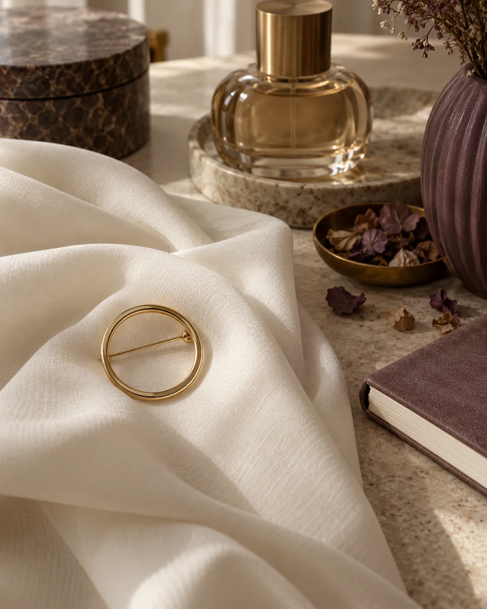
The brooch edit
Style an Open-Circle Brooch With Simple Folds
Read the note ↗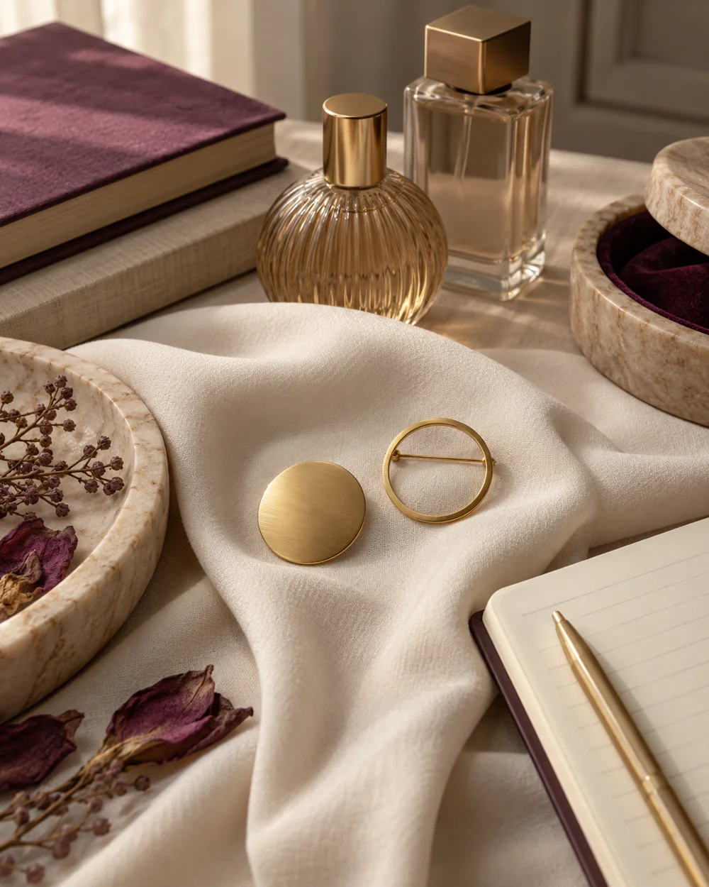
The brooch edit
Compare Solid and Open Geometric Brooch Shapes
Read the note ↗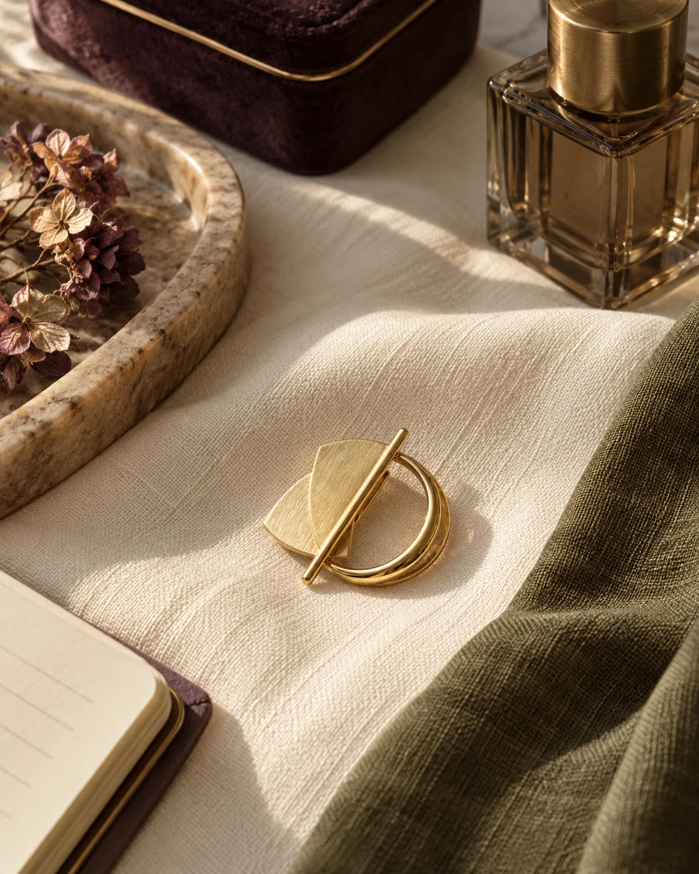
The brooch edit
Use a Narrow Accent Color Beside a Brooch
Read the note ↗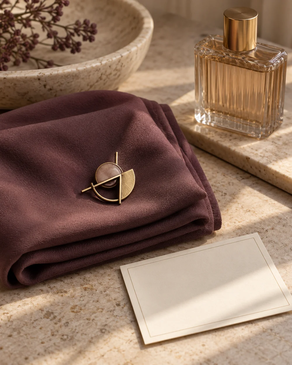
The brooch edit
Create a Balanced Three-Object Accessory Still Life
Read the note ↗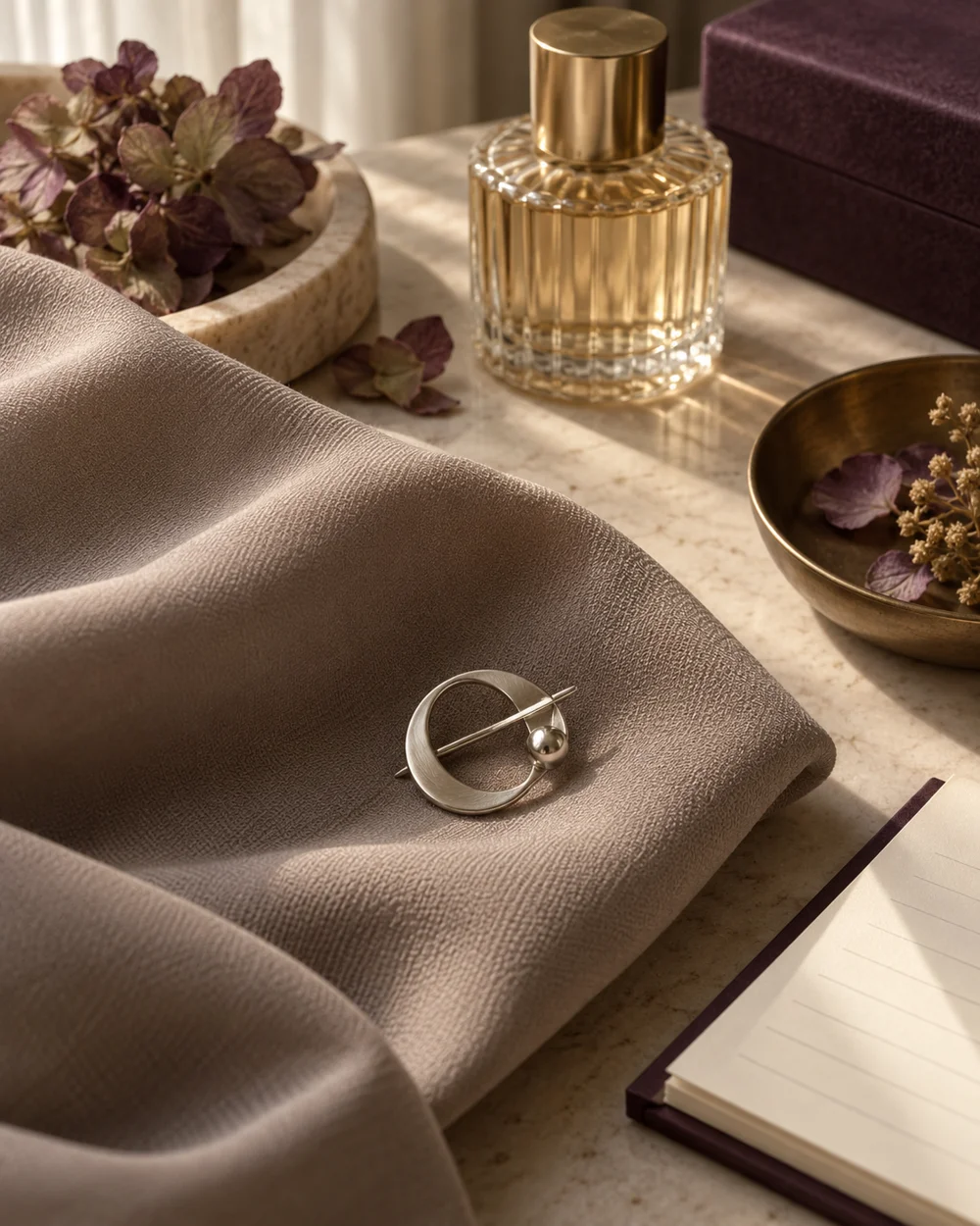
The brooch edit
Compare a Small Brooch Against a Large Fabric Fold
Read the note ↗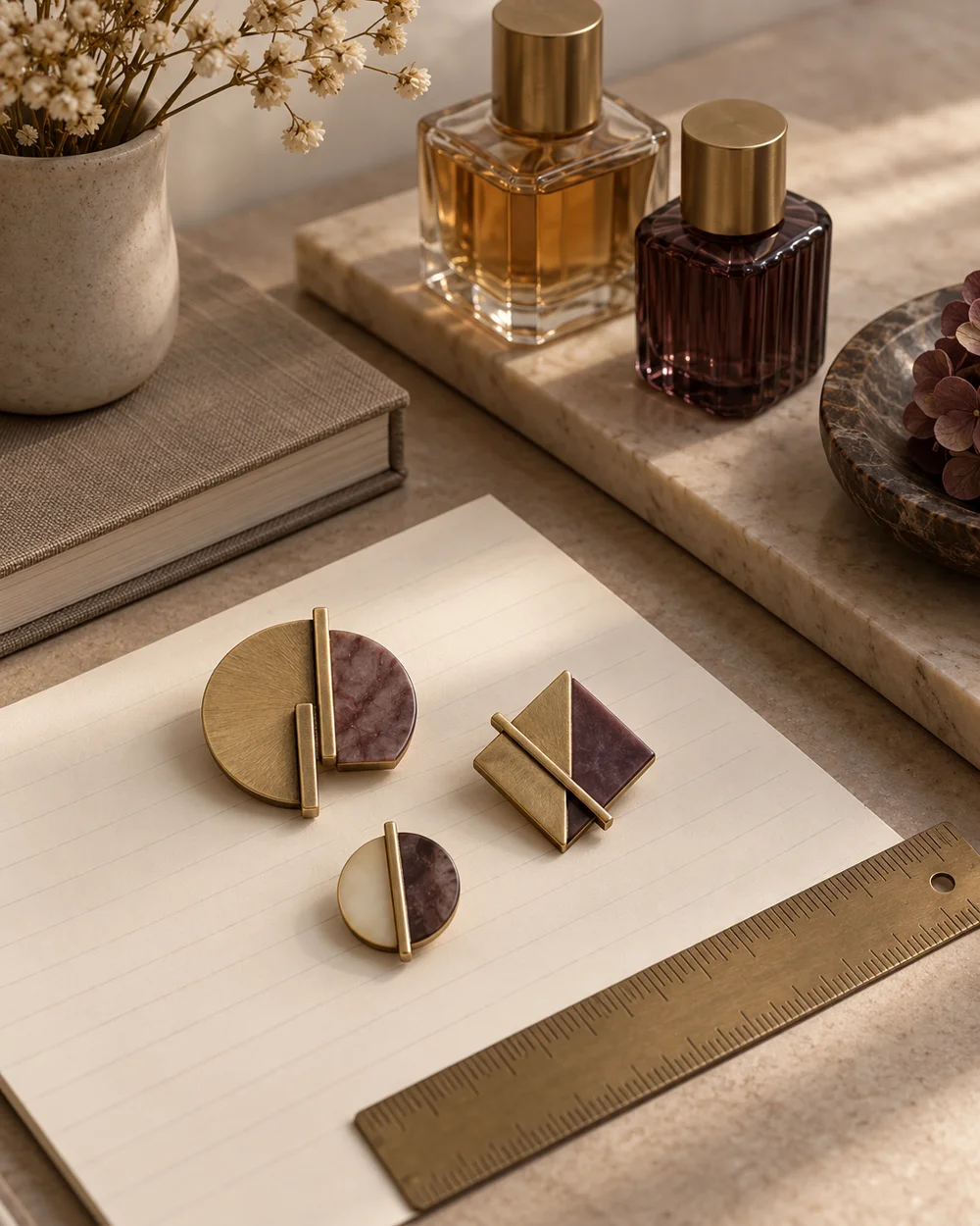
The brooch edit
Make a Simple Brooch Size Reference Sheet
Read the note ↗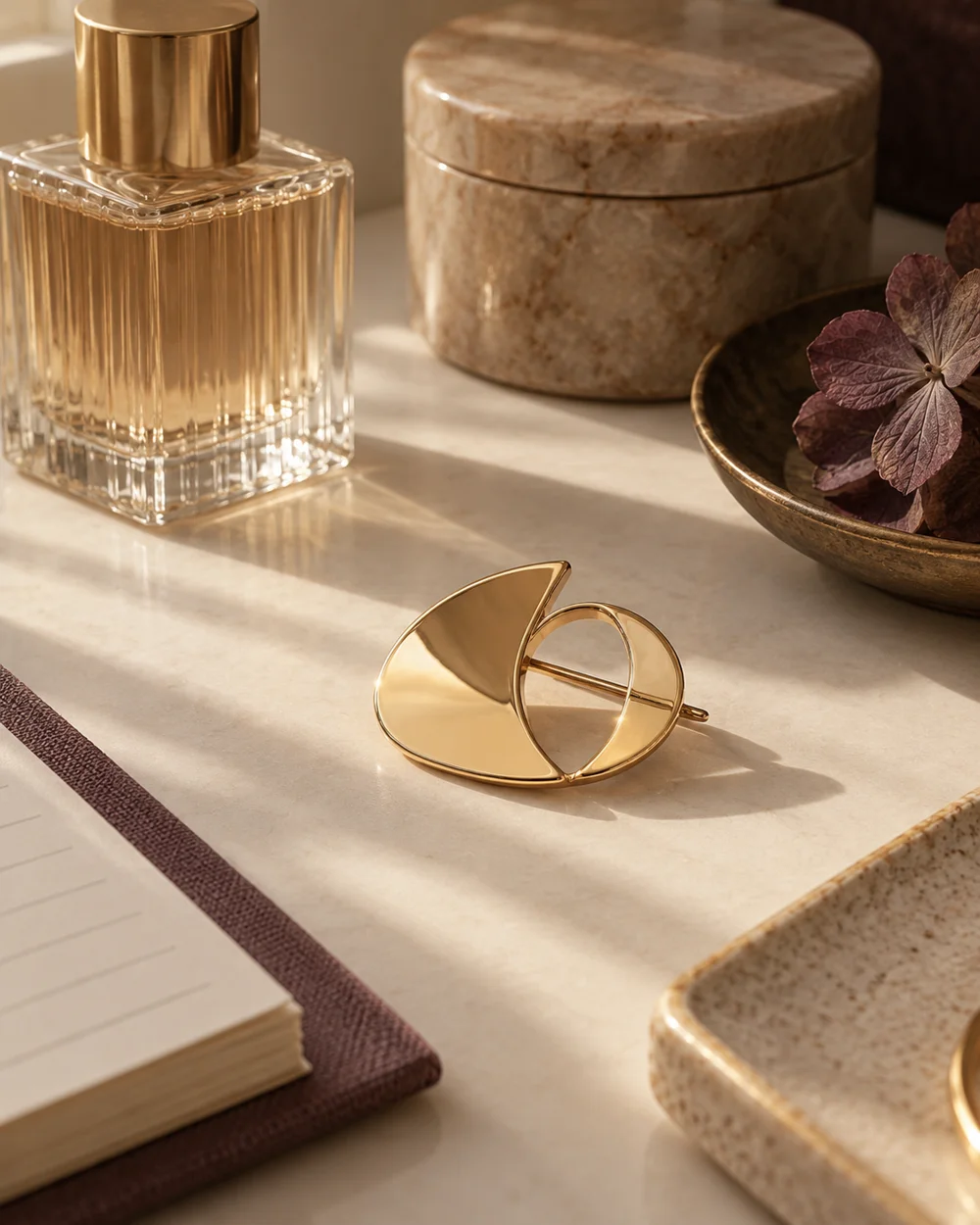
The brooch edit
Photograph a Reflective Brooch With Soft Side Light
Read the note ↗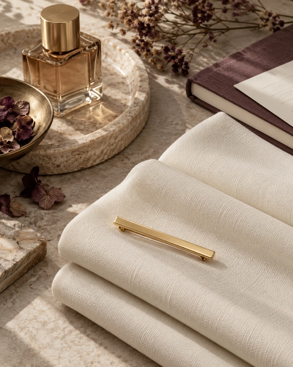
The brooch edit
Use Repeated Lines in a Brooch Arrangement
Read the note ↗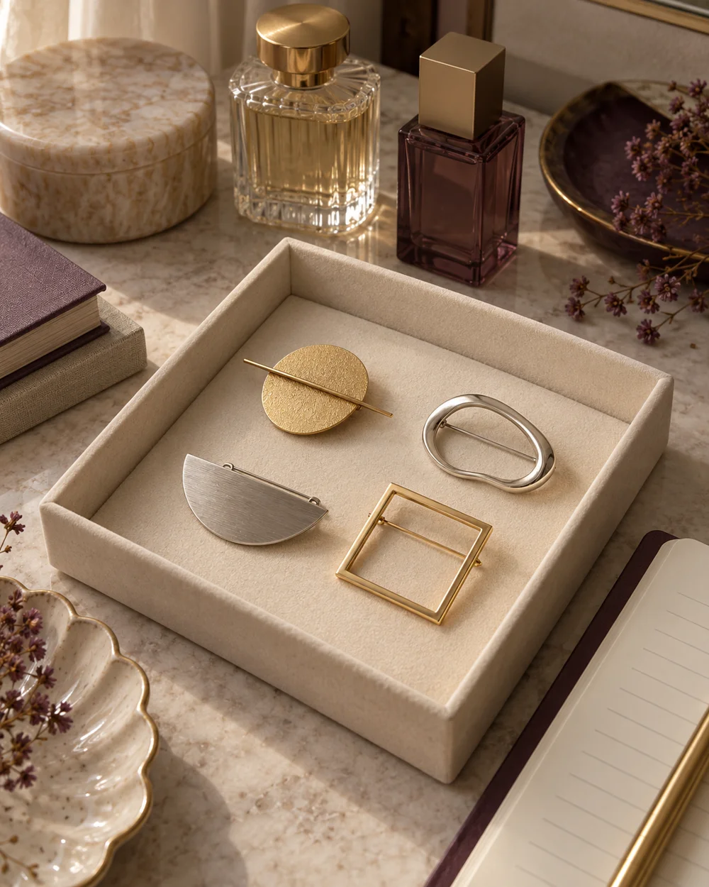
The brooch edit
Choose One Brooch From a Small Existing Collection
Read the note ↗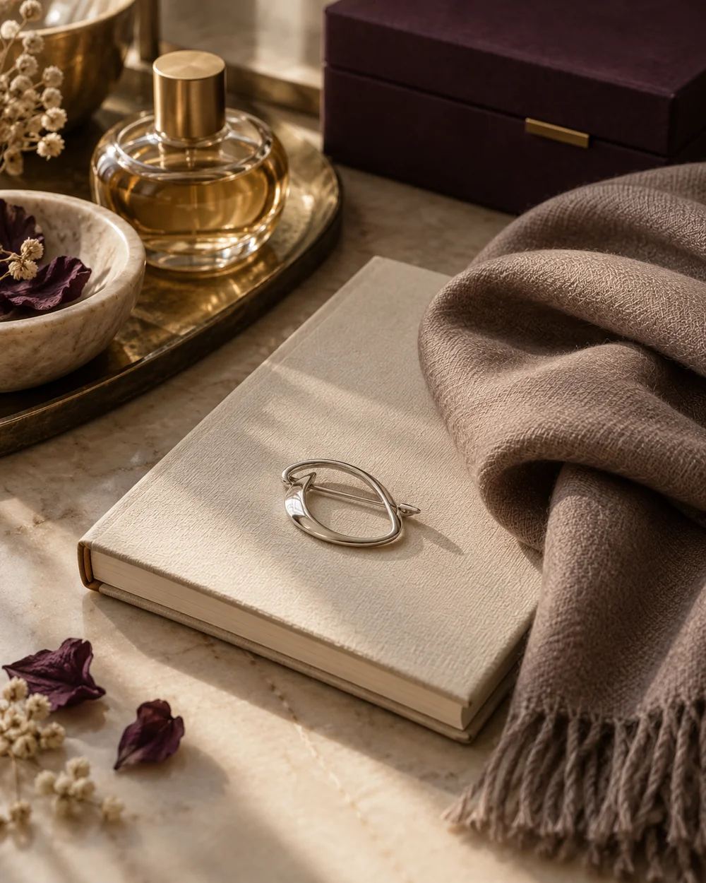
The brooch edit
Build a Quiet Accessory Arrangement for a Notebook Photo
Read the note ↗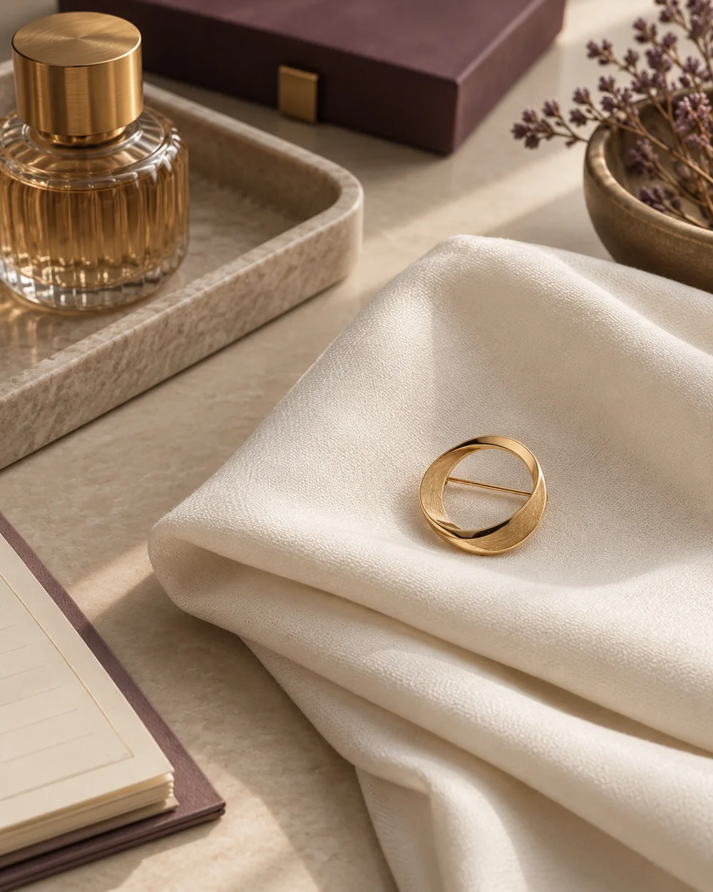
The brooch edit