Keep a Scarf Palette Consistent Across Photos
Consistent reference photos make a small scarf palette easier to compare later. Keep the setup simple enough to repeat without a professional studio.
Read the note ↓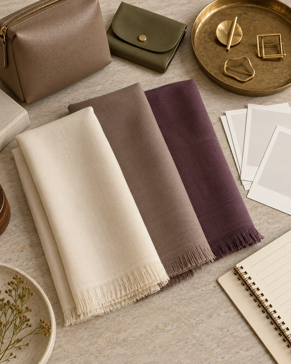
NOTE 01
Choose the actual pieces
Choose one clean neutral background and a familiar indirect light source. Set a clear camera position and use the same broad folding approach for each opaque scarf.
NOTE 02
Make the first arrangement
Photograph one piece at a time with room around its edges. Keep product labels or inventory references outside the final public image but connected in your private record.
NOTE 03
Compare one change
Compare the set for obvious framing and lighting differences. Rephotograph an inconsistent reference rather than heavily editing one image to force a match.
NOTE 04
Keep a useful reference
Store the images under clear item names and keep the actual labels for materials and care. Consistency supports recognition without guaranteeing exact color on every screen.
Before you go.
What is the most useful detail to remember?
Repeat the setup rather than trying to correct every difference afterward.
What should I establish before starting?
Choose one clean neutral background and a familiar indirect light source. Set a clear camera position and use the same broad folding approach for each opaque scarf.
Original editorial guidance. Photographs are AI-generated concepts; they do not show verified products, material specifications, or tested results. Sources & approach.
Save to Pinterest ↗FOLLOW THE DETAIL
A note to read next.
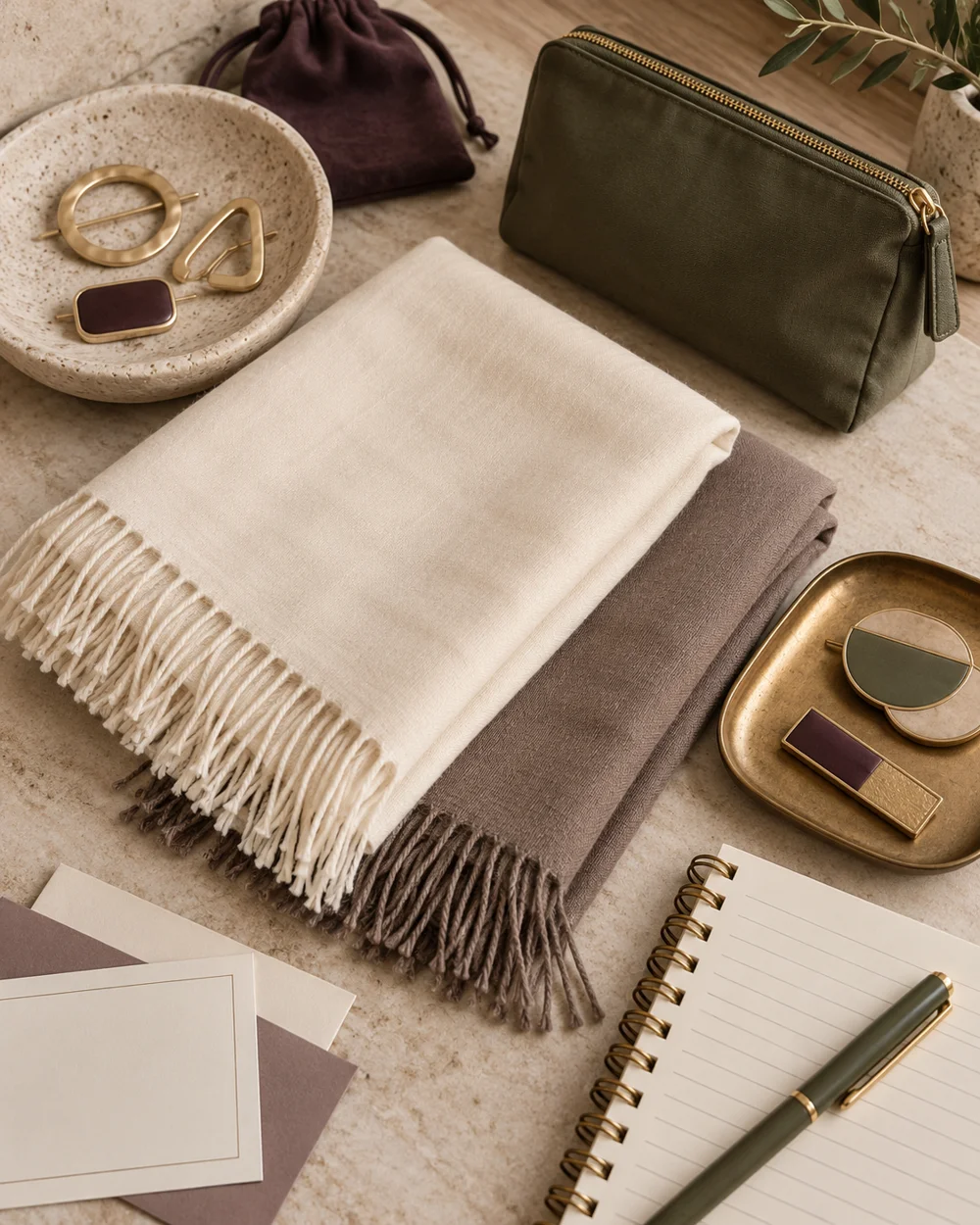
Scarf palettes
Build an Ivory and Taupe Scarf Palette
Read the note ↗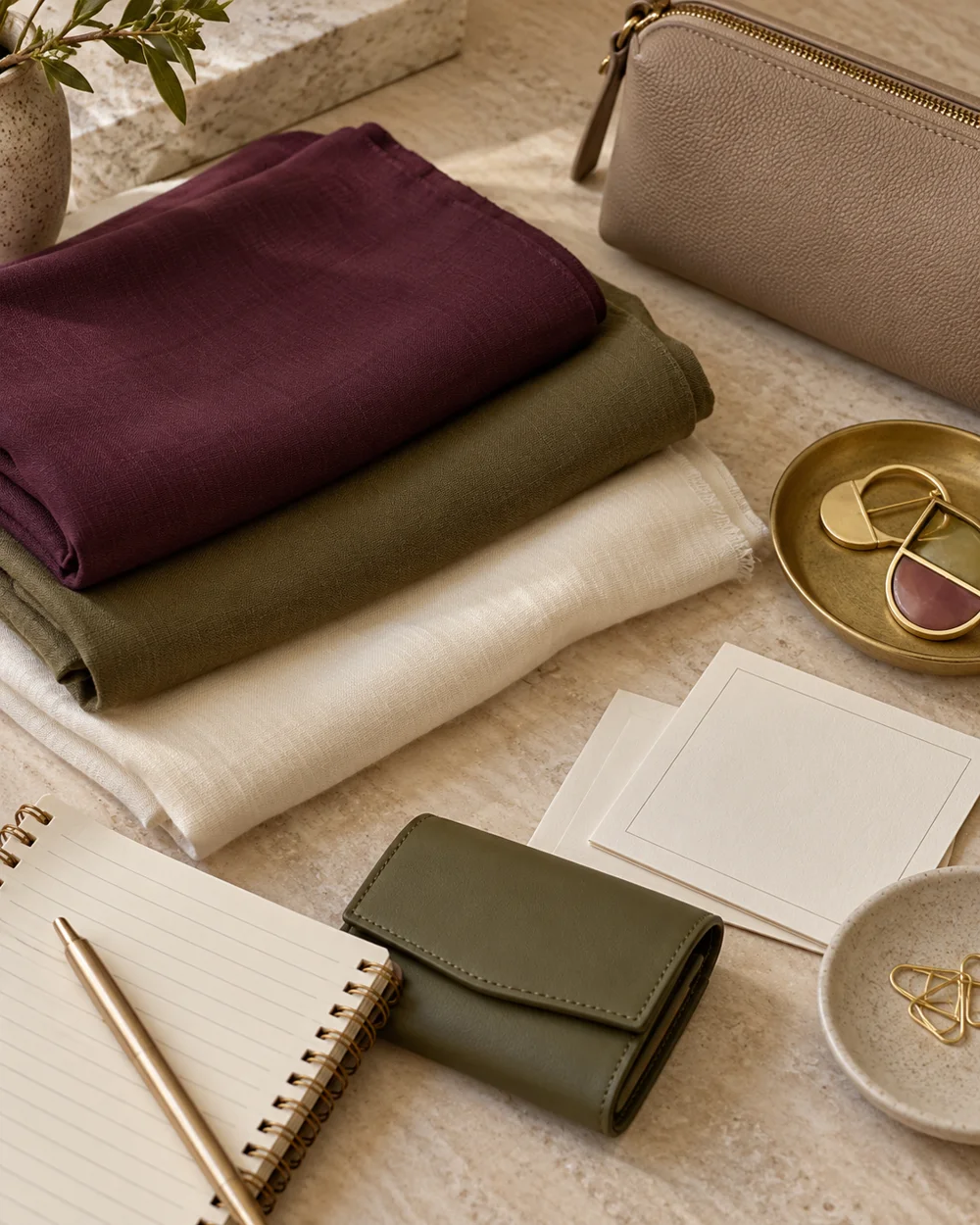
Scarf palettes
Compare Plum and Olive Scarf Accents
Read the note ↗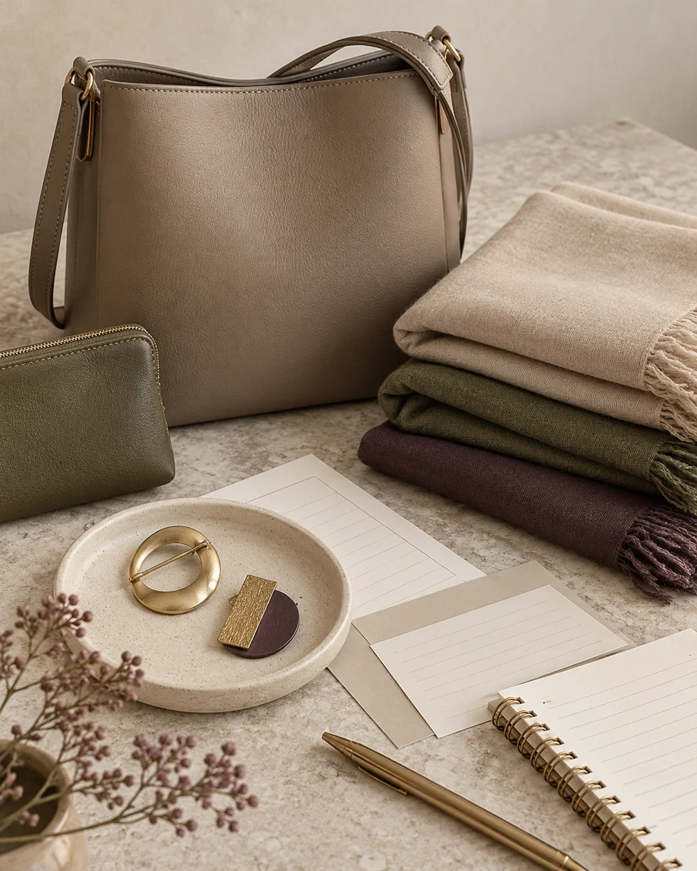
Scarf palettes